Summer is so close again… How wonderful is that, guys? I don’t know about you, but I can’t wait to enjoy more time outdoors, hit the beach, take some time off work and have tons of picnics and rooftop parties 💛✨☀ To get the spirits even more in the summer vibe, here’s a collection of…
Tag: graphic design
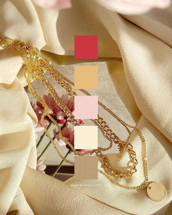
Beautiful Lovecore aesthetic color palettes for Valentine’s Day creative projects!
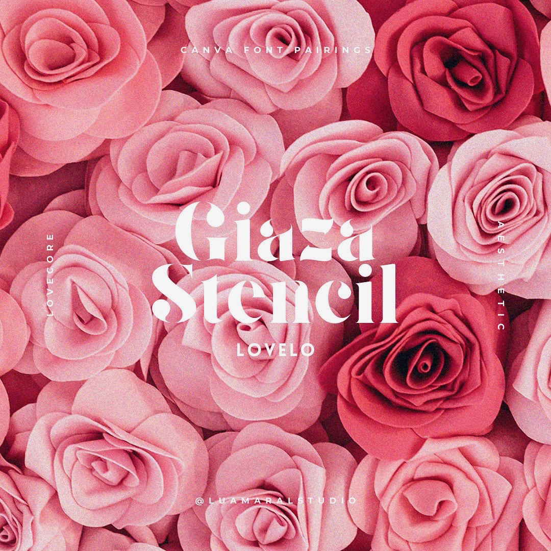
Lovecore CANVA font pairing inspo to get into Valentine’s Day mood ♥
LOVECORE has been my favourite aesthetic in the last few weeks. Granted, it was February, I know, I know… But still. I’ve been learning more and doing lots of research on this aesthetic, and it’s just fascinating 💌 If that’ your case too, this post might be useful. Especially if you’re currently creating something beautiful…
Aesthetic edit tutorial: How to make the sexy shadow edit
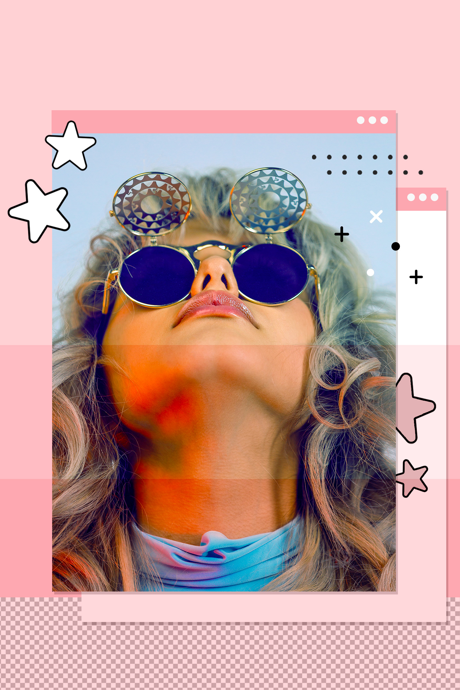
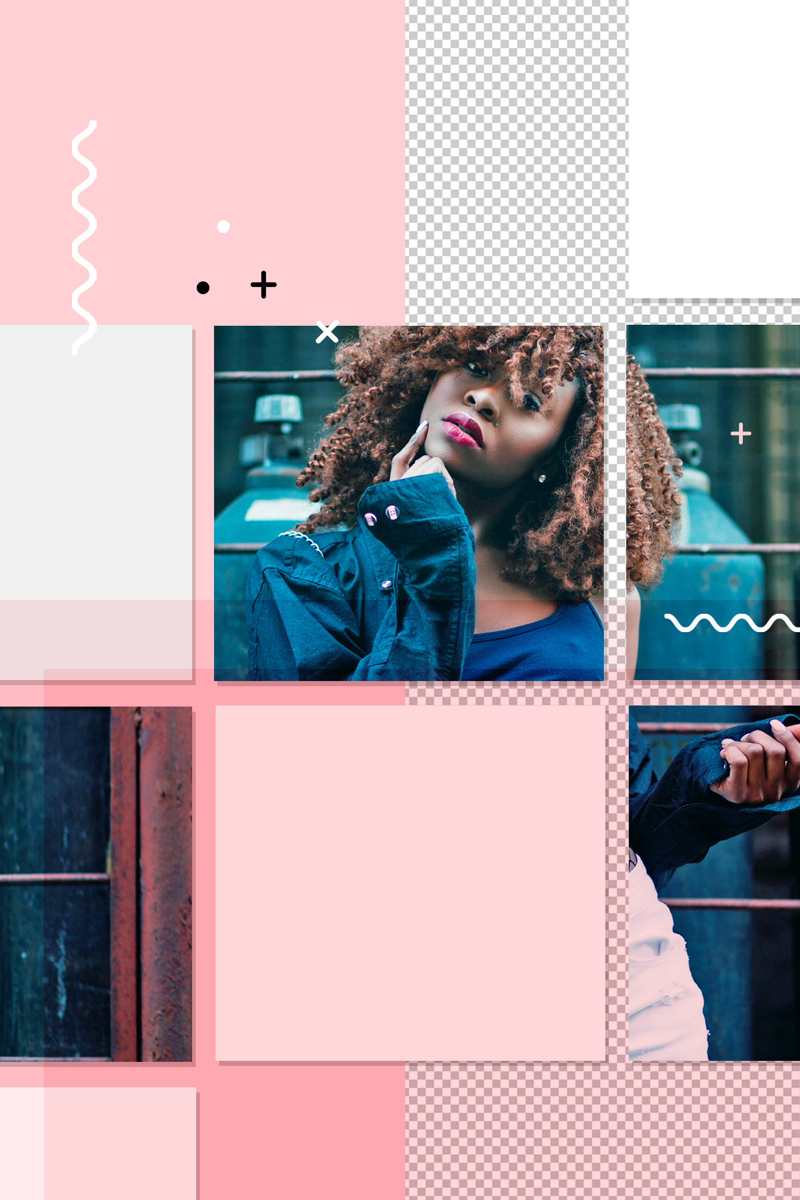
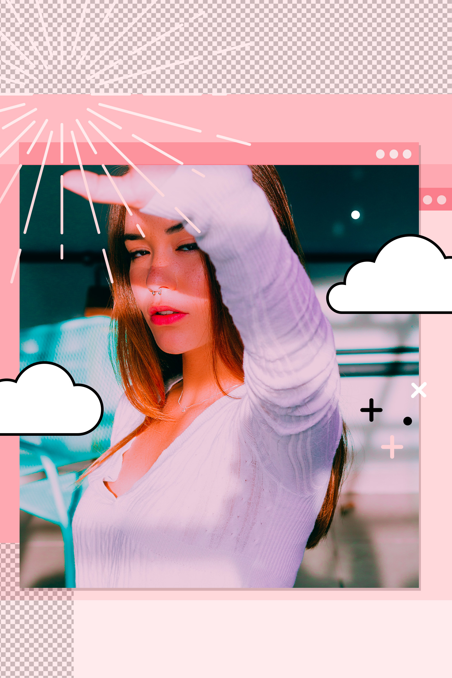
You’ve seen these pics before, haven’t you? On Pinterest, they’re always at the top of searches like “pink aesthetic” and “baddie aesthetic”, which means they’re SUPER trendy and cute, and we love them 😍 From Pinterest So I decided to make a TikTok showing how easy it is to create edits that emulate that type…
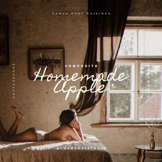
Cottagecore font pairings (from Canva) to try
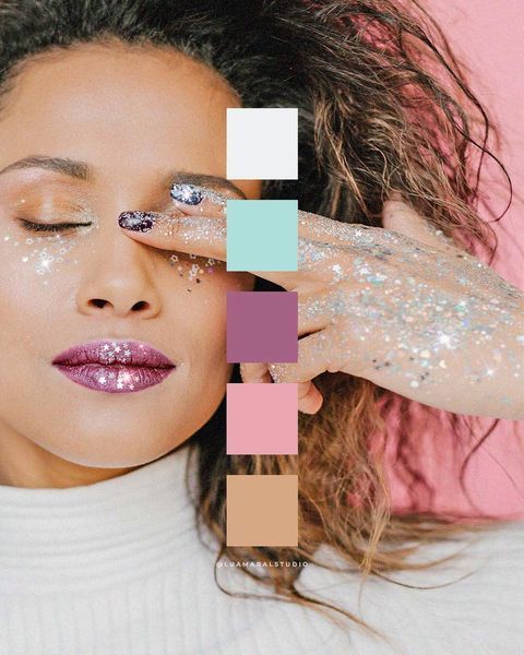
Fairycore aesthetic color palette ideas
Every time I start searching for fairycore aesthetic images on Pinterest my mind gets completely lost in the fantastic world of those wonderful little things 🧚🏾✨🤍 The images are so so pretty! So today I’m bringing you some inspo in the fairycore universe. More specifically, color inspiration! Hopefully one of these palettes will be the…
Aesthetic Canva font pairings for logos you haven’t tried yet
Introducing: the Aesthetic Design Shop by Lu Amaral Studio
How to have an aesthetic Instagram feed – Part 5 of 5: Uniqueness
And here we finally are, chicas. We’ve reached the last post of our Instagram feed special! 🦄💜 We’ve been through the importance of brightness, alignment, disposition, filters and now we’ll talk about uniqueness.That finishing touch that will make your feed authentic, special and different from everyone else’s 💖💫🤩 Of course, this step is optional. You…
How to have an aesthetic Instagram feed – Part 4 of 5: Filters and photo editing
How to have an aesthetic Instagram feed – Part 3 of 5: Disposition
I’ll start the post apologizing for the delay! 😣 I was supposed to have published this post sooner, but the last days were super busy around here with a lot of stuff going on! Anyway, shall we resume our special? 💖💫 If you haven’t read the previous posts yet, we’ve already talked about the importance…
How to have an aesthetic Instagram feed – Part 2 of 5: Alignment
Hey guys! Continuing our special in 5 steps of how to have an Instagram feed that is neat, beautiful and authentic (I keep changing these three words to keep you interested haha), today we’ll focus on the ALIGNMENT. Yesterday I wrote a lot about the importance of brightening the photos well, so if you haven’t…
How to have an aesthetic Instagram feed – Part 1 of 5: Brightness
Hey chicas! 🌻🧡 As I mentioned in the introductory post, a series of posts on Instagram feed organization starts today here on the blog, with tips on how to have the pretty, authentic, organized instagram feed of your dreams. I’m super excited about this series, and hope it will be helpful! So let’s jump to…
SPECIAL ☆ How to have an organised, pretty and aesthetic Instagram feed – The ultimate tutorial!
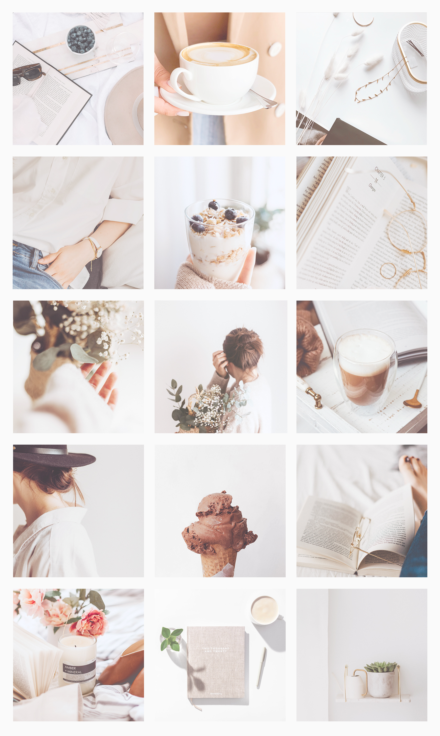
FINALLY! It’s here! I’ve been meaning to write these step by step posts on how to have a cute, organised, aesthetic Instagram feed for ages, and now it’s finally happening. I’m so happy! Lately tbh Instagram Aesthetic is all I’ve been thinking about and working on. And I know you guys are super into this…
Freebie: Brand Book PowerPoint template for all my self isolated business owners out there
Aesthetic edit tutorial: 5 tips to create beautiful mockups easily
I looove creating mockups! I use them to showcase my work on social media and here on the blog, and sometimes to present designs created for clients too. It looks more professional and helps them (and me!) visualize the layouts 🤩😍 First of all, in case you’re wondering what is a mockup in graphic design:…
My absolute FAVS! Apps, softwares, websites, devices, & design resources I use daily
Aesthetic edit tutorial: How to make realistic mood boards with overlay shadow
30 free paper textures for backgrounds ready to download and use
Heyy guys, how are you doing? Don’t you just love using good quality textures on design backgrounds? I’m always alert while browsing the web for good resources to download and collect 💕✨ I love using paper textures because they’re light and easy to blend on, and it gives a human touch to the composition. So…