
Hello my loves, how are you all doing?? 🌻🌻
I see a lot of people dreaming about a white background Instagram feed. Is it your case? There’s a good chance that’s why you ended up here!
I understand the appeal of the white background feed very well. I had one myself for a while…
I prioritized photos with a very clear background. It looked super clean and professional, and well organized too. There’s no doubt it can be really elegant. But I stopped doing it because it was soooo much work, so many pics I couldn’t post because it didn’t match the aesthetic… and it took hours to edit each simples post :/
I wrote a whole post about hard to maintain insta feeds, where I elaborate on this subject. We’re not here to discuss that today! Our focus are the tips on how to achieve a beautiful white background Insta feed.
Just an FYI, I highly suggest you take a look at my special 5 posts on Instagram feed organization for general tips on Insta feed designs. There is a lot of useful information there, so that could be an excelent starting point ✨✨
In one of the posts for the special, I spoke briefly about white feeds, and about the fact that the most important thing if you want one, is to take and pick the photos you’ll post with the feed in mind. The selection of the image is key here. You should use clear images, with as few colors as possible, or with the colors that match your palette. The edits are important too, but this first part is crucial.

However, there are other ways to lighten the feed without necessarily having only super bright pics. If you have design skills, you can make collages where the base is all white, and the photos, whatever color they are, are placed on top. Some called these “infinite background”. You can also use polaroid frames [post here] or white borders around the photo [post here] 🙂
💡 A cool feature to use in your designs are high resolution white textured backgrounds. Here’s 4 options that can be used as a background for quotes, collages, and designs of all sorts. I got these from Unsplash:
White backgrounds for download
How to have a white instagram feed
If your goal is a feed composed only by photos -no collages, no borders, nothing like that- then the photos you take (or look for online) have to be super bright, like I mentioned above. In that case, the production of the pics must be done carefully, taking into account shadows, light, and everything that can affect the quality and sharpness of the photo ✨
I posted here about flatlays that I think can be very useful. With the phones we have access to nowadays, even if they’re not the newest most advanced one, it became easy to take great photos without major productions.


How to edit white background images
Some tips to remember always:
- The VSCO app is my favorite photo edit app among the free options. There’s a whole post about it here.
- Be careful when taking white background photos not to over burst the light in a way that the contours and shape of the image are lost.
- In addition to increasing the lighting, I recommend regulating the temperature of the image. Cool the photo down might be a good way to lighten it up. But it’s up to you, and your prefered aesthetic.
- If you prefer, you can apply a premade filter. Just be aware that they affect each image differently. So use the edit tools to adjust them afterwards, if necessary.
I created 5 feed ideas especially for this post, aiming to show the possibilities within the clear background spectrum so you can observe the differences between them, and help you choose the option that best fits your goals.
White background Instagram feed ideas:
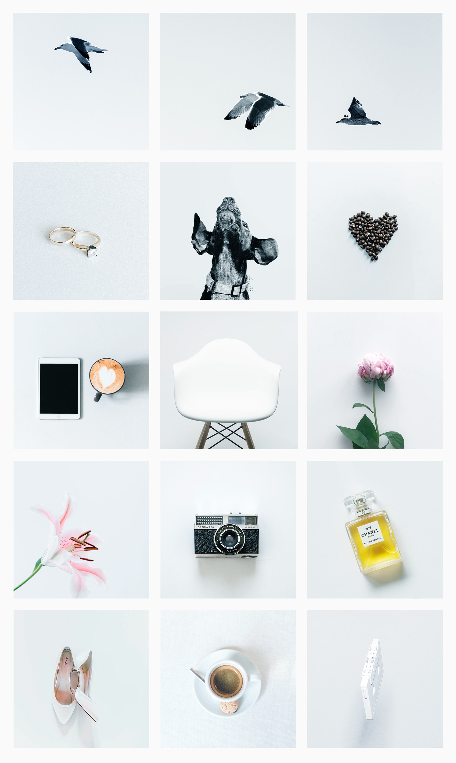
1. Abundant brightness
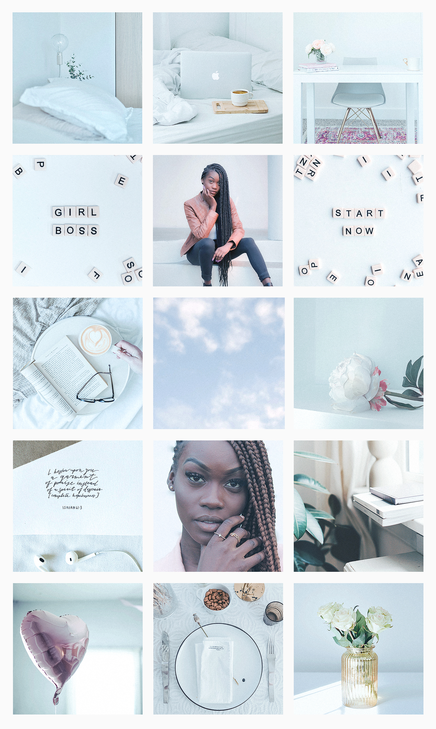

On this feed, all the photos are super bright and with clear backgrounds. In the video I made showing the development, you’ll notice that I made the backgrounds more bluish on purpose. I think that makes all the photos look more similar to each other, and gives adds character for the feed.
2. White background + solid color
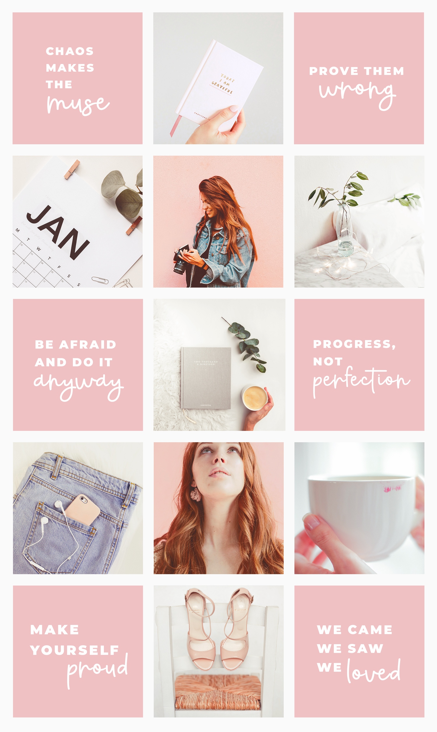

Here’s a second example with a light background, but the feed is not entirely white. In fact, I believe that when people say they want a feed with a white background, they often refer to this. They are photos with a clear background, basically. Pure white is very artificial and almost impossible to achieve.
⟡ Love this feed? Get this theme by only U$1 ⟡
3. White background + minimalism

This white feed on the other hand is much more extreme. Super hard to keep something like this up in real life, right? Hahah! But I couldn’t help including it.
Still, the backgrounds of the photos are not really white. As I mentioned above, it looks way too fake. So here I tried to standardize the tone of the backgrounds of all the photos, which was not identical (it would take hours to be hahah), but it got closer!
This is one of the types of feeds that some people call “infinite background”. I’ll write a post on that subject soon, with more details.
4. White borders
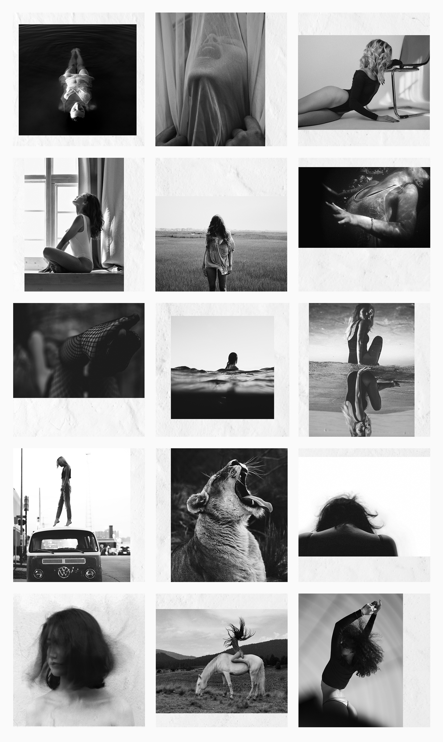

They’re not really borders, but empty spaces in each post, showing the background. In the video below you can understand what I mean. This example looks more like a collage than a bordered feed, actually. You can also fit inside the “infinite background” category, I guess, that I’ll post about soon.
See how the white background seems to lighten up the whole feed?
But, as I always say, I don’t think these designs work for any feed, and I don’t find it easy to maintain. In my opinion, only artistic feeds look so beautiful, as long as the design is done professionally, and the photos have a lot of quality. But it’s just a personal opinion!
5. White background + warm tones
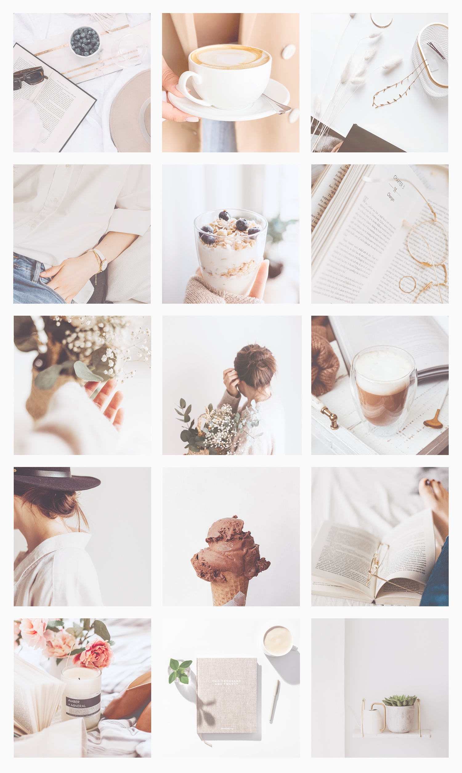

Finally, a blogger style Instagram feed, with clear backgrounds and neutral shades. It goes from almost pure white to a different shades of gray. But at first glance what you see is a super bright feed with predominantly white backgrounds. Right?
It’s also interesting to notice that, for example, the photo with the cup of coffee at the top row has no light background. But it still blended well, because a large portion of the image is white. In addition, it is very symmetrical and centralized, giving an incredible sense of harmony and order. All of this, added to the fact that it matches the aesthetics of the rest of the feed, made it work greatly.
⟡ Love this feed? Get this theme by only U$1 ⟡
I hope the feeds are inspiring and the information helps. If any clarification is missing in the post, just leave a comment here, which I will probably answer in a few minutes. Instagram messages take days, and sometimes I forget! 😅
I’ll leave some images down here for you to practice, or use on your feeds. Everything via Unsplash, as always …
White background images for Instagram
Beijos,
Lu


