

Tumblr is a frequent topic here on the blog, right guys?
I wrote a post explaining what is a tumblr photo, and it is one of the most accessed every day here. Good to know that you like it and want to know more about the theme ☺️ ♥ ️
In that first post, I even explained my story with tumblr, which comes from years ago. I have always LOVED and used tumblr a lot, and I can say that I understand the aesthetic that is attributed to it.
So you can trust what you read here. It’s from experience ♥ ️
In today’s post, I’m going to bring you an easy, objective, explanatory MEGA tutorial to learn once and for all how to make a tumblr photo, or an “aesthetic photo” if you will. I was dying to do this, and now that I’m at the hairdresser waiting for the product to take effect on the hair, it couldn’t be a better time 😜


I won’t spend too long explaining here what a tumblr photo is, because there is a whole post talking about it hehehe! So run there to read if you’re in doubt.
Important: There are all kinds of tumblr pictures. Some don’t fit what I’m going to talk about here, I know… But I’m talking about the style in general, okay? Please take this into account 🙂 But the conception that any spontaneous photo is tumblr does not proceed either. It is an incorrect generalisation!


Anyway, let’s get to the tips, shall we?
How to take Tumblr photos?
1. Spontaneity in the pose is more important than anything
Most of the most beautiful tumblr aesthetic photos capture a scene. Have you noticed that? They tell a mini story, a vibe … They don’t feel like a click. So the first thing to keep in mind is this!
But no worries, don’t be intimidated by the complexity of what I said no. Keep reading that you will see that it is simpler than it looks. I will talk more in point 3 about this issue of having a meaning and feeling in the photo.
At this point here we will focus only on the act of bringing naturalness to your pose and expression.


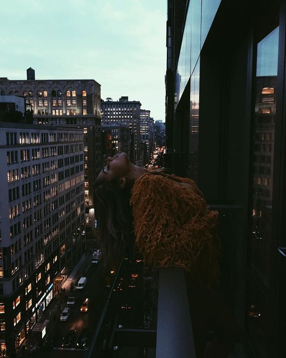


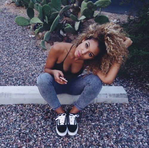

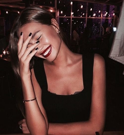


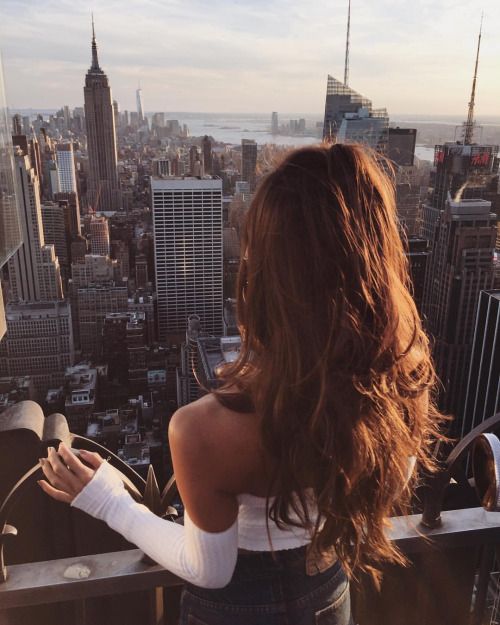

How to do it: The most common thing we do when photographing is to look at the camera and smile, it’s almost our natural instinct. Maybe because it is what we are conditioned to do, it ends up being very obvious and becomes dull, lifeless, predictable and even a bit boring?
So: Turn around, cover your face, make a face, do a little dance, grab an object near you and play with it, look at your nail, give a kiss on the cheek of the classmate on the side (only if you’re close friends!!), laugh out loud… Put an action on the pose, as if they had clicked without you realising it, the tumblrometer on your photo will go up a lot 🌡
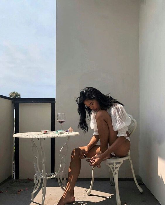


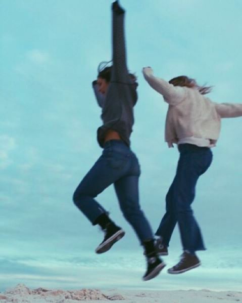

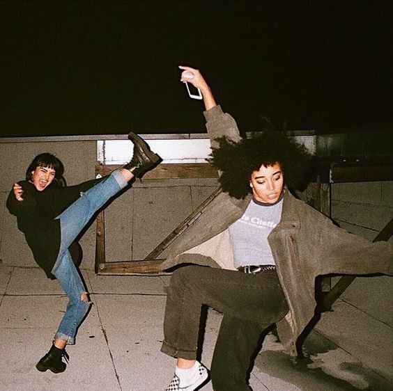

Even if you don’t have this habit yet, and until you find yourself super difficult, you can learn it. And get used to it until it’s natural. Your photos will be sooo much more aesthetic, I promise!
“damn Lu, these photos you’re using on the post are beautiful, I’ll never be able to get anything like this.” Guys, every time friends show me photo and go “oh, too bad I closed my eyes , or” fuck, it’s blurry!”, or “omg why is it so dark” ” or the freaking light got in the way “…. I think to myself: man with the proper editing that photo will look SO cute.
What I’m trying to say is: if you want to have a tumblr photo, learn how to see the potential in a pic that might look bad, but really isn’t 😉
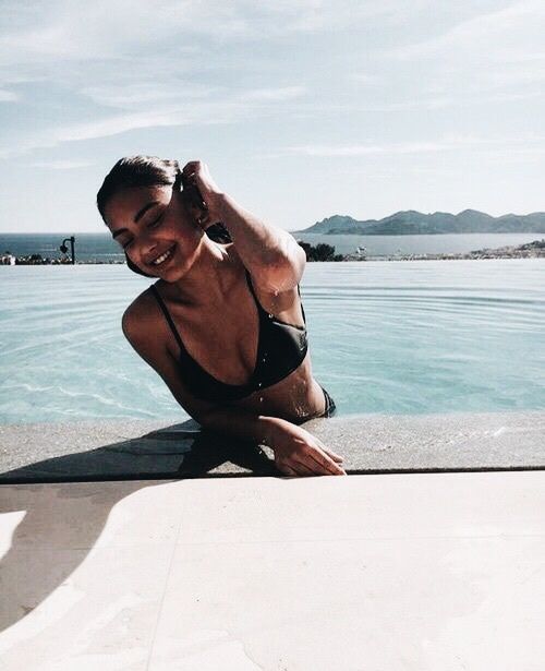

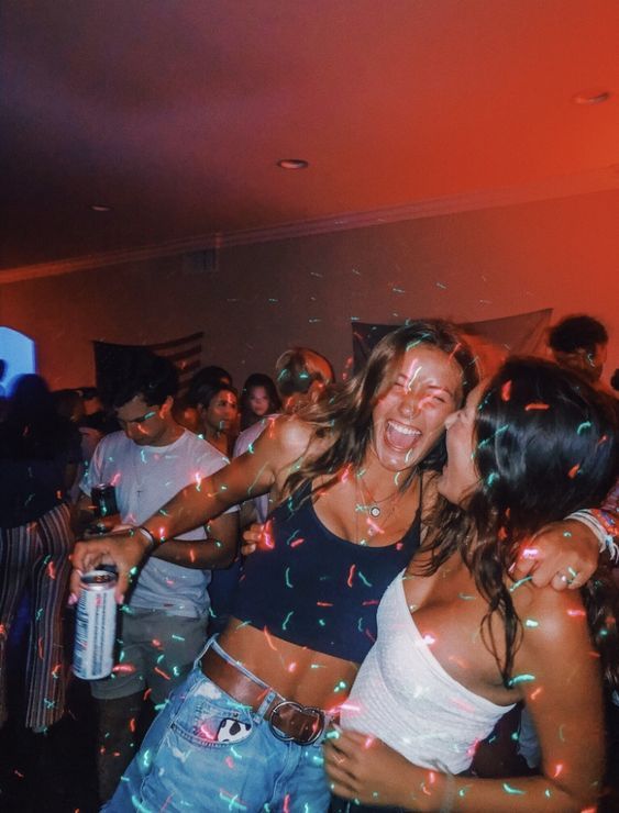

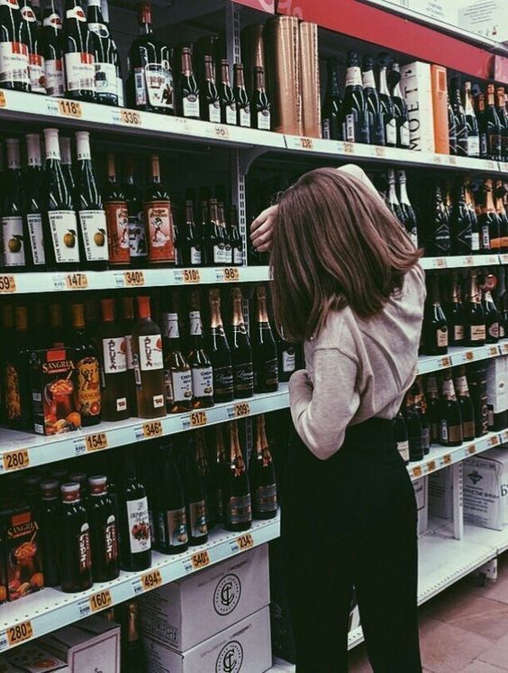

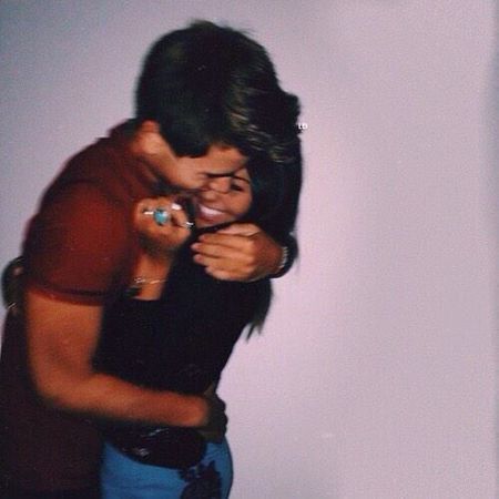

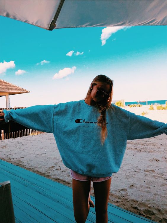

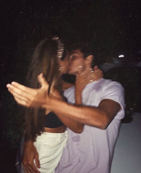

And that’s exactly what I’m going to talk about now…
2. The quality MUST be bad. Of course, because.. Wait, “bad” ??? WTF?? 😂
This little secret always shocks people hahaha! If you think that to make an amazing photo in a tumblr style you need a professional camera, professional model, direction and professional editing, you are sadly mistaken, my friend.
It is quite the opposite.


What characterises a true tumblr aesthetic photo is that it looks natural, real, authentic. And with a young and free spirit. This has always been the great differentiator of tumblr, so photos in this style need to be like this. And professional photos don’t have that real effect.


Ultra sharp images, with fantastic resolution and perfect people with professional looks and impeccable makeup are not tumblr. They have their value, combine with fashion editorials, with commercial photos for brands, etc. But the tumblr photo is made with a cell phone. It’s rough, real, complex and simple. Then you’ll get on an editing app and make the quality even worse !! 😂😂
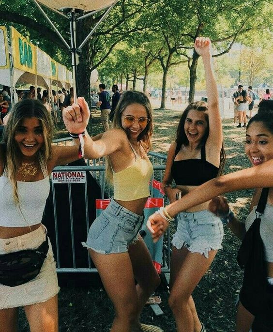

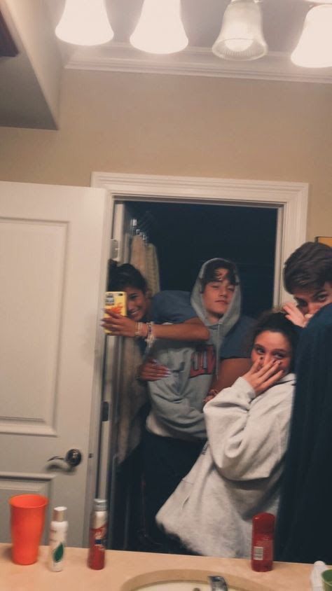

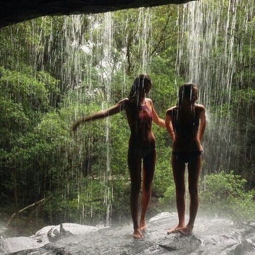

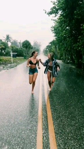

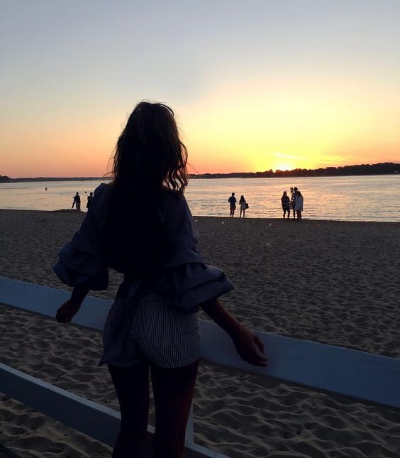


You might be asking: ‘That’s weird, Lu. All my photos would be tumblr if that was the case. They’re all spontaneous and with poor quality. All my photos are like that! Why doesn’t it have the beautiful effect of those that go viral? ‘ Come on!
How to do it? Full disclosure, I don’t really think it’s a case using f lower quality cameras, or lower resolution. Use the best one you have. But I would eventually try to put some deliberate “flaw” in the composition, if “tumblr photo” is the aesthetic you’re going for.
Sometimes an object on the way, some shadow overlaying, bursting light “disturbing”, something more crooked or misaligned, an unusual angle, something out of focus… You know when you’re going to take a photo and someone says: oh, but it’s against light , it will be very dark… Sometimes that dark tone is makes the photo beautiful. You have to try it!
And if, even so, the photo is in excellent quality, you can leave it to make the adjustment when editing. You can follow a more natural photo path, with less contrast and less vivid colors. Or if you prefer, pop the colors well and bet on a very urban aesthetic too. The important thing is to run away from anything that seems too perfect ✨


Technological evolution has reached a level of perfect quality for the photos so great, that the human eye rejects all this perfection. And even big editorials, fashion essays and the like give a way to decrease the quality of the images produced in some way.
Of course, in their case the resolution itself remains AS HIGH AS IT GETS, they are not actually doing anything in bad quality. In fact, that’s not what I’m teaching here, I overplay it. The idea is to simulate something more real, so that there is a greater identification of those who look.


Hence the success of the grain effect in the photos (most read post from here on the blog), or the 90s style filter. These effects take that whole perfection out of the photo, make it more human. In short, they give the image a …
3. Soul
I give this little secre that name, because it is the best way I found to explain that “something” certain images have that is difficult to explain. It’s the abstract content, the sentiment. It can be a nice little heat.
It can be a surprising identification (sometimes hilarious hahah), it can be a tenderness, a charm. It is often just a well being. An intense desire to be living that. For being both incredible and kind of familiar …


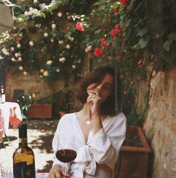

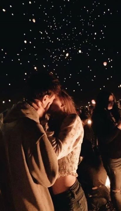


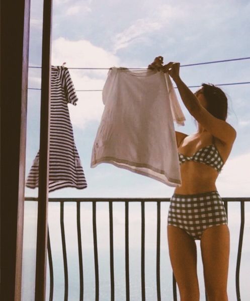


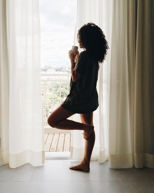

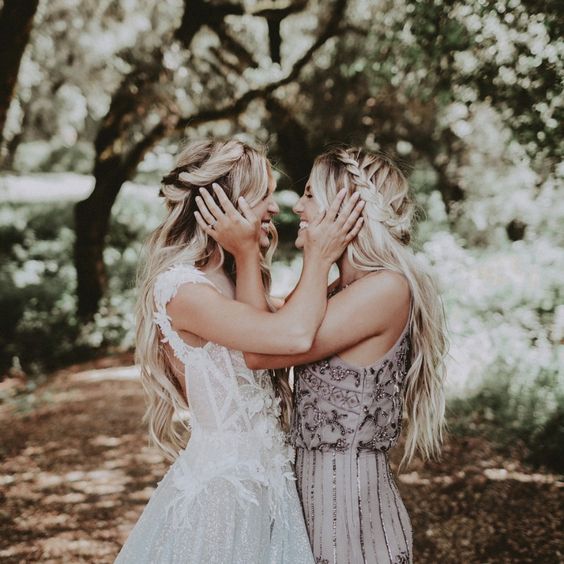


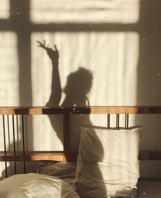

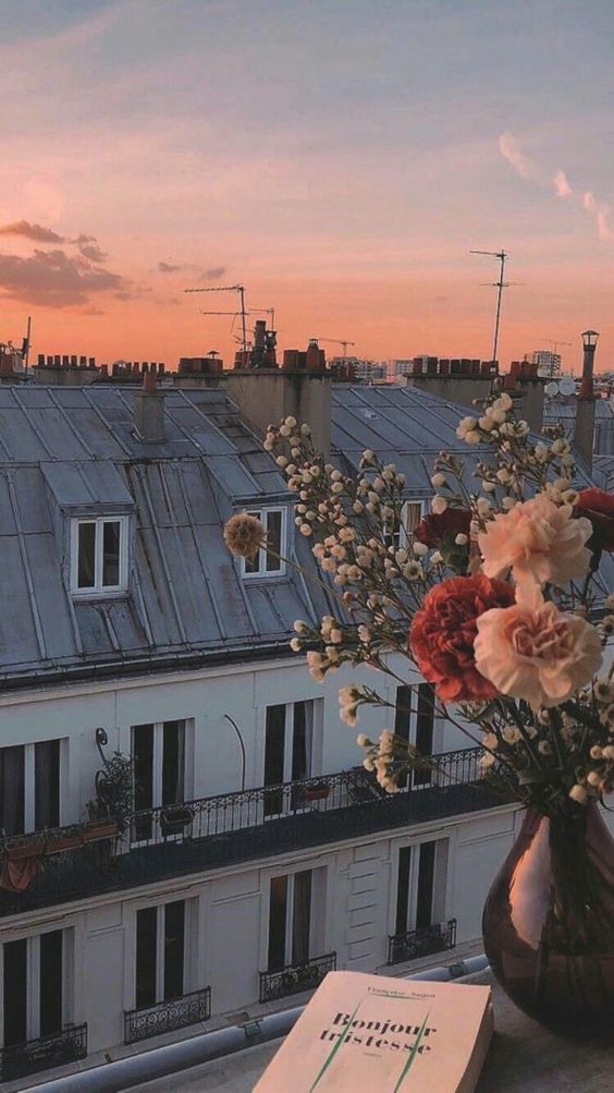

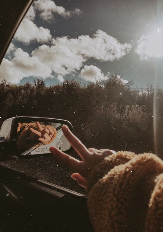


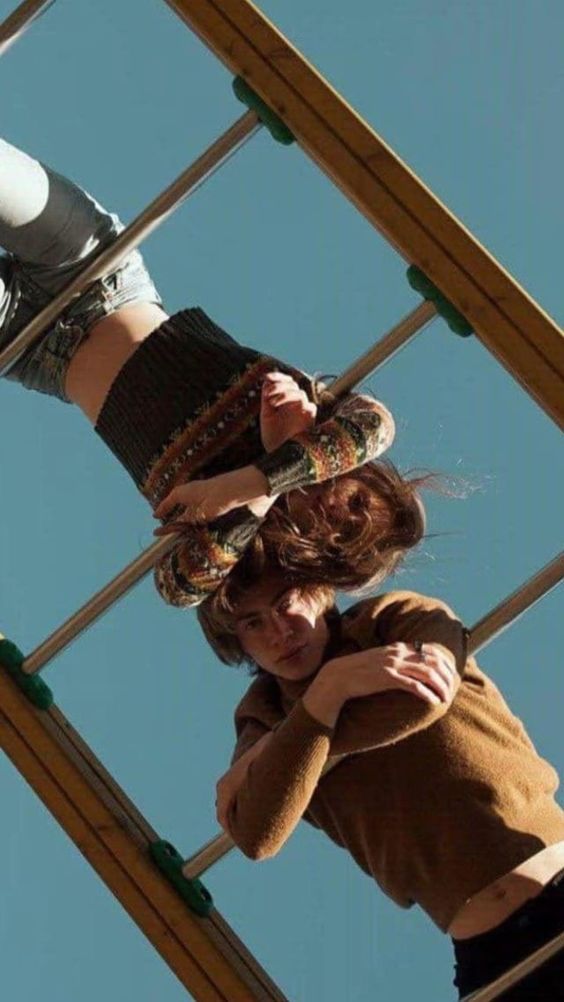

How to do it: Difficult to teach this point. But I will try.
We usually like to photograph moments that are special. If you can capture why he is special, the most interesting thing that situation provides you, you capture her soul. You can feel the photo.
One way I like to do this is by getting out of the obvious, out of the comfort zone. There’s a table full of people having dinner and you want to register the moment?
Instead of that bland picture in front of the table with everyone turning sideways, with an uncomfortable expression, he climbs on the chair, tells everyone to continue talking, asks someone to pass a pot to another, says something funny for everyone to laugh about… and don’t let anyone look at the camera! 😂😂 I made up a situation here, it may be absurd, but it’s just an idea.. no hate and no shade please haha!
How does this work on the Instagram feed?
‘Ok, Lu. I understood how you make a tumblr photo. Now how do I make my entire insta feed tumblr?’ Well, my love, my first recommendation would be to read my special with 5 posts about organized and beautiful feeds. I teach in detail how to create a feed with consistent aesthetics, and without a doubt you will learn a lot about it there. Hence the essential is to follow those 5 steps, to define the style of your feed and plan it. And take these tips into account here with regard to the photos themselves.
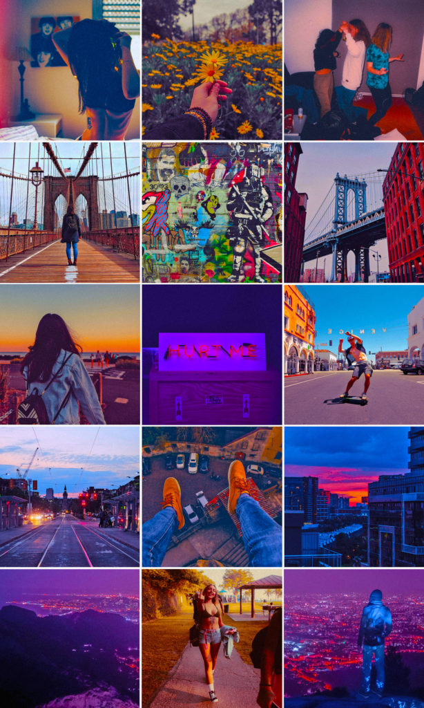
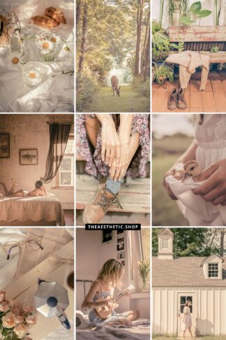
One thing I find very interesting is that, in some cases, a photo in a tumblr style, alone, is ok, cool, beauty. But you take several, put them all with the same aesthetic, same filter, and neatly distributed in a feed (or collage, or layout), everything is cooler. Super union is strength 👊🏼👊🏼🦋🥰
Garanteed!
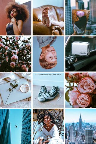
Some feedS I created with a tumblrish type aesthetic:


I will close this post with the TUMBLREST photo that has ever existed:
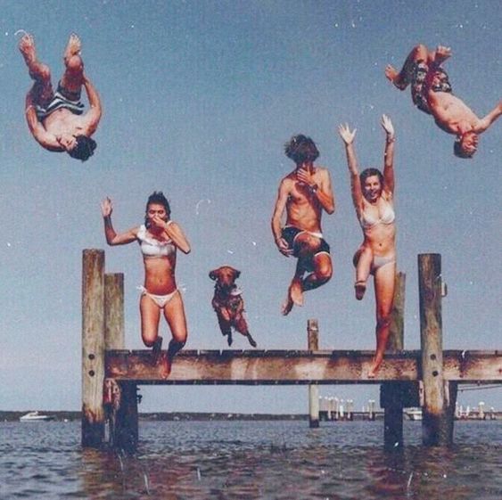

Beijos,
Lu
Ps. My hair looks amazing, the 2h in the salon was worth it haha - photos on insta soon.
Discover more from The Aesthetic Shop
Subscribe to get the latest posts sent to your email.
[…] it many times here on the blog, I’m a huge fan of blurry, grainy images that look imperfect but have so much soul and you can almost feel them. That’s why I love photos with overlay shadows too! […]
[…] interesting. But choosing special, unusual images full of emotions and soul (read more about those here) will make your collage look […]
[…] Here’s a post I wrote about how to create tumblr photos yourself! Check it […]