I’ll start the post apologizing for the delay! 😣 I was supposed to have published this post sooner, but the last days were super busy around here with a lot of stuff going on!
Anyway, shall we resume our special? 💖💫
If you haven’t read the previous posts yet, we’ve already talked about the importance of brightening the photos, how to align them correctly, and now let’s talk about the disposition of the images on your feed. Ready?


Harmonious disposition
Disposition is the most challenging of the 5 steps on this special, I think. Specially if you have a personal account, and your posts happen spontaneously, so you can’t plan the feed ahead. And don’t get me wrong, being able to figure out what you’ll post for the next days, weeks and months is not easy!
But it does help A LOT to place the posts in the most harmonious possible way in advance, using apps like Preview or Unum, and to make the decision about what to post when, and even how to edit each picture individually, based on what will be next to it, above it, etc.

Sure this habit of planning a feed is much more common for businesses and for brands that already have the content in hand in advance. But some influencers or anybody who aspires to be influencer or to grow their personal accounts can also do this.


So should I always plan my feed in advance?
You don’t need to. In fact, more often than not, it turns out to be one more obstacle that blocks your content from flowing more consistently. So, instead, you can just pay attention to the weight disposition of the photos as you post them. As we all know, Instagram doesn’t allow us to change the order of the photos once they’re posted :/
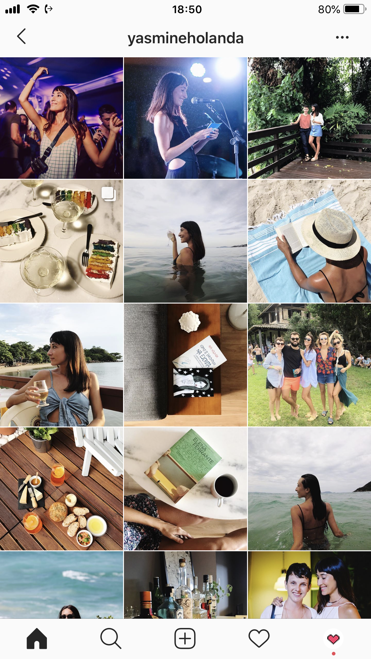
So, let’s say, the last image was a selfie. Ideally, the next post would have a larger breather area around it. Or, even better, not show any humans at all. Selfies and photos with people, in general, have a heavier “weight” of information, because we create a strong human connection when we see them 🙃
With that in mind, take all possible types of photos into consideration and try to puzzle them together in a way that is harmonious. If you can I made an illustration to explain this visually:
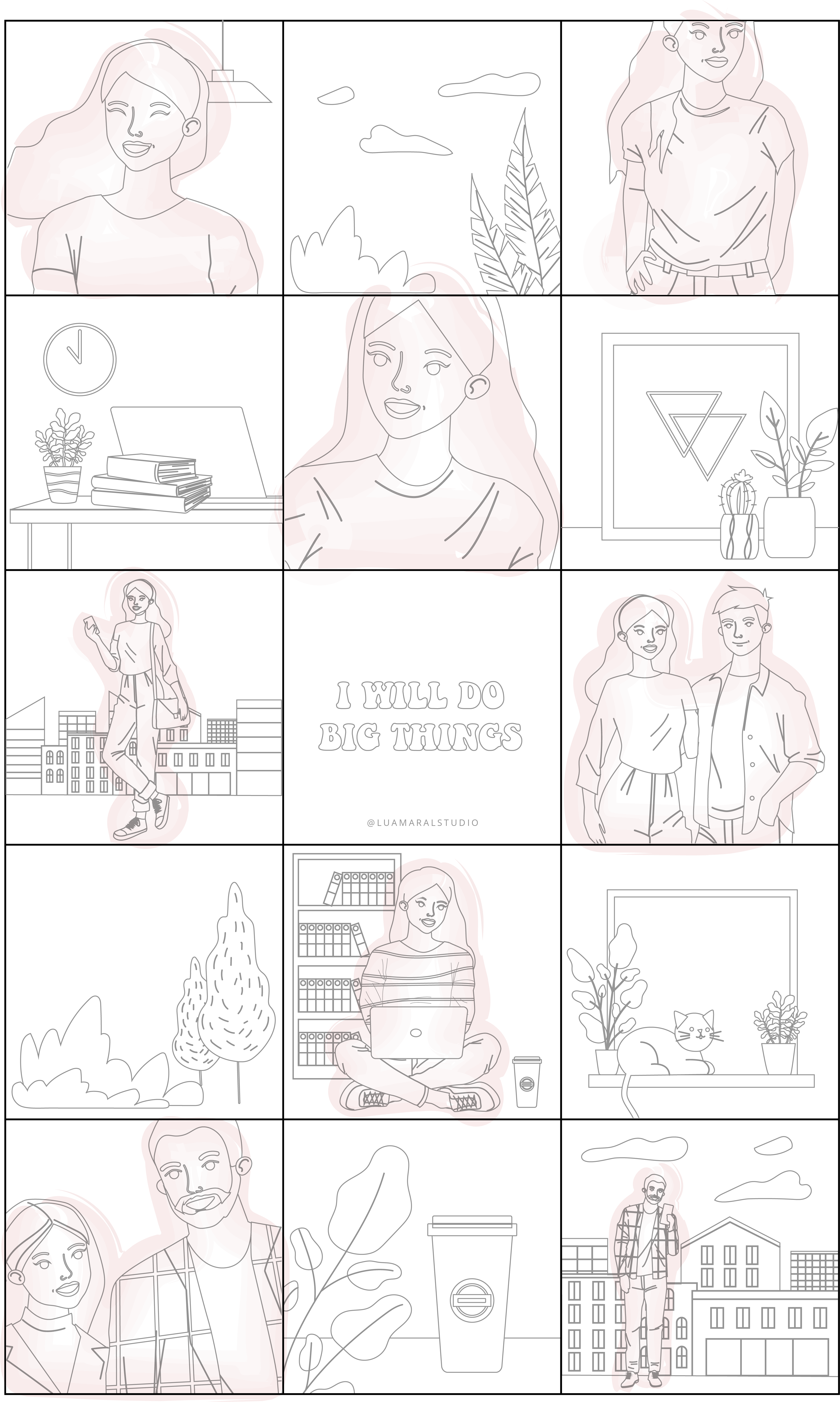

Keeping the photos of yourself only on every other post, and using different angles and frames, you’ll find a good overall balance! 💎💎💎
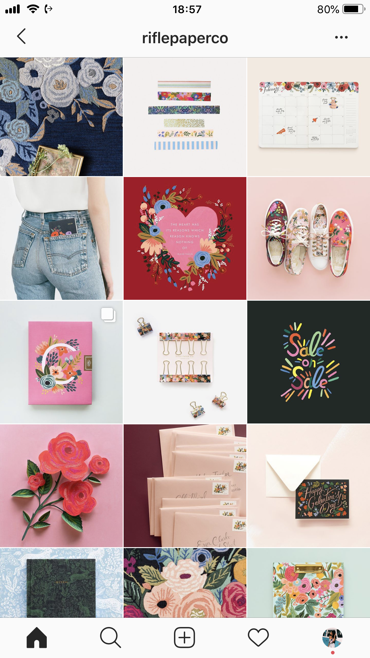
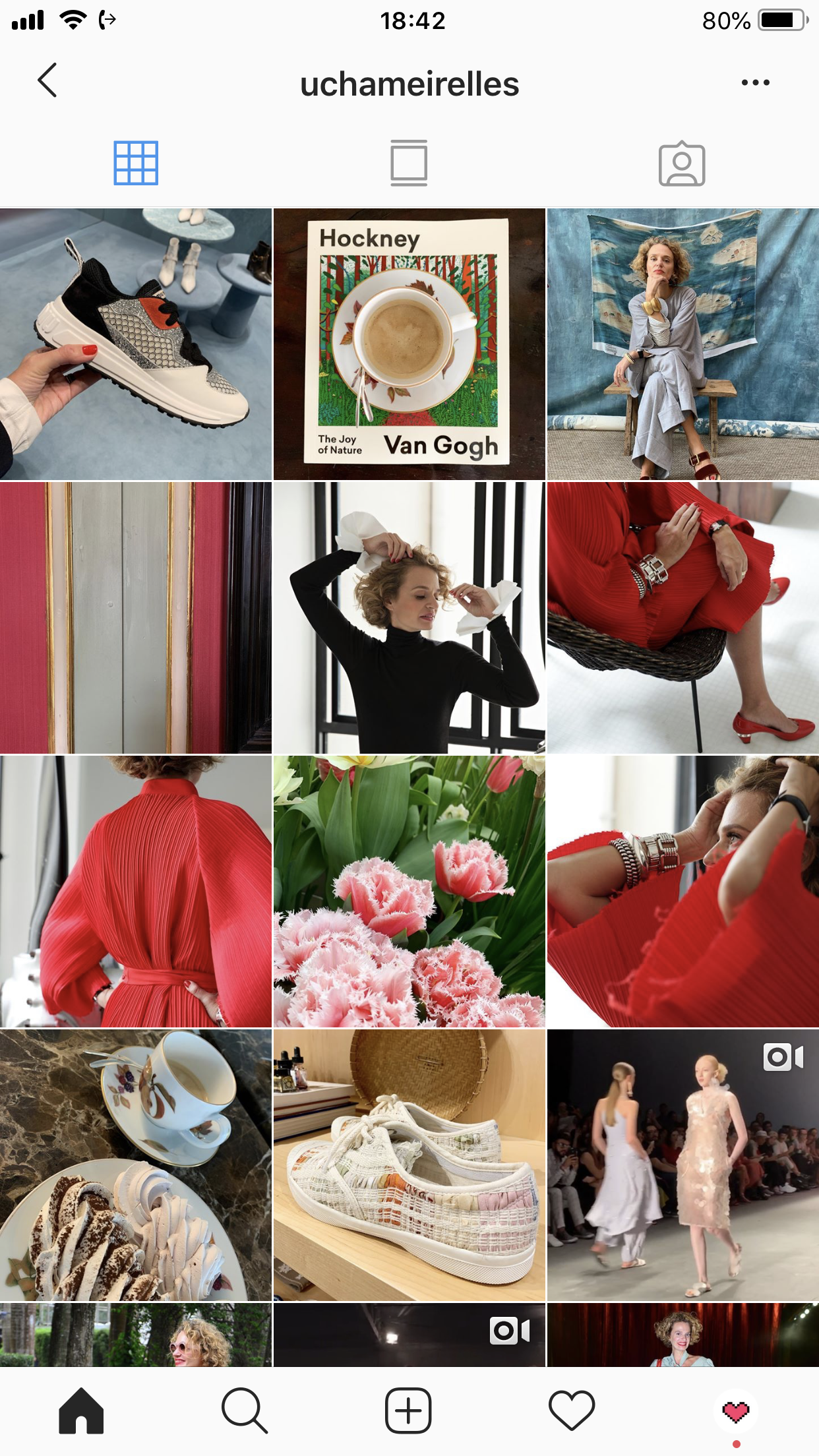
That logic goes for both personal and product accounts. For example:
If it’s feasible and makes sense to you, all photos having the same weight can result in a pretty neatly organized feed too. But it has to be a conscious choice, and you should stick with it strongly. Take a look:
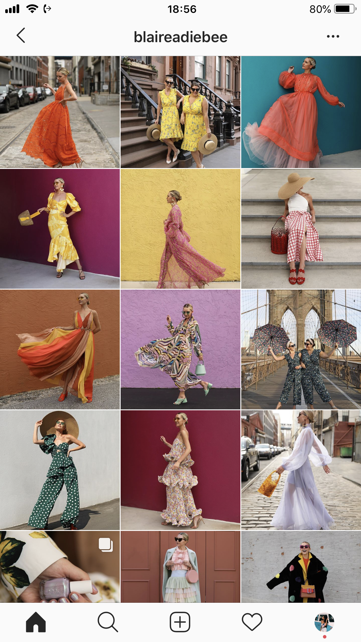
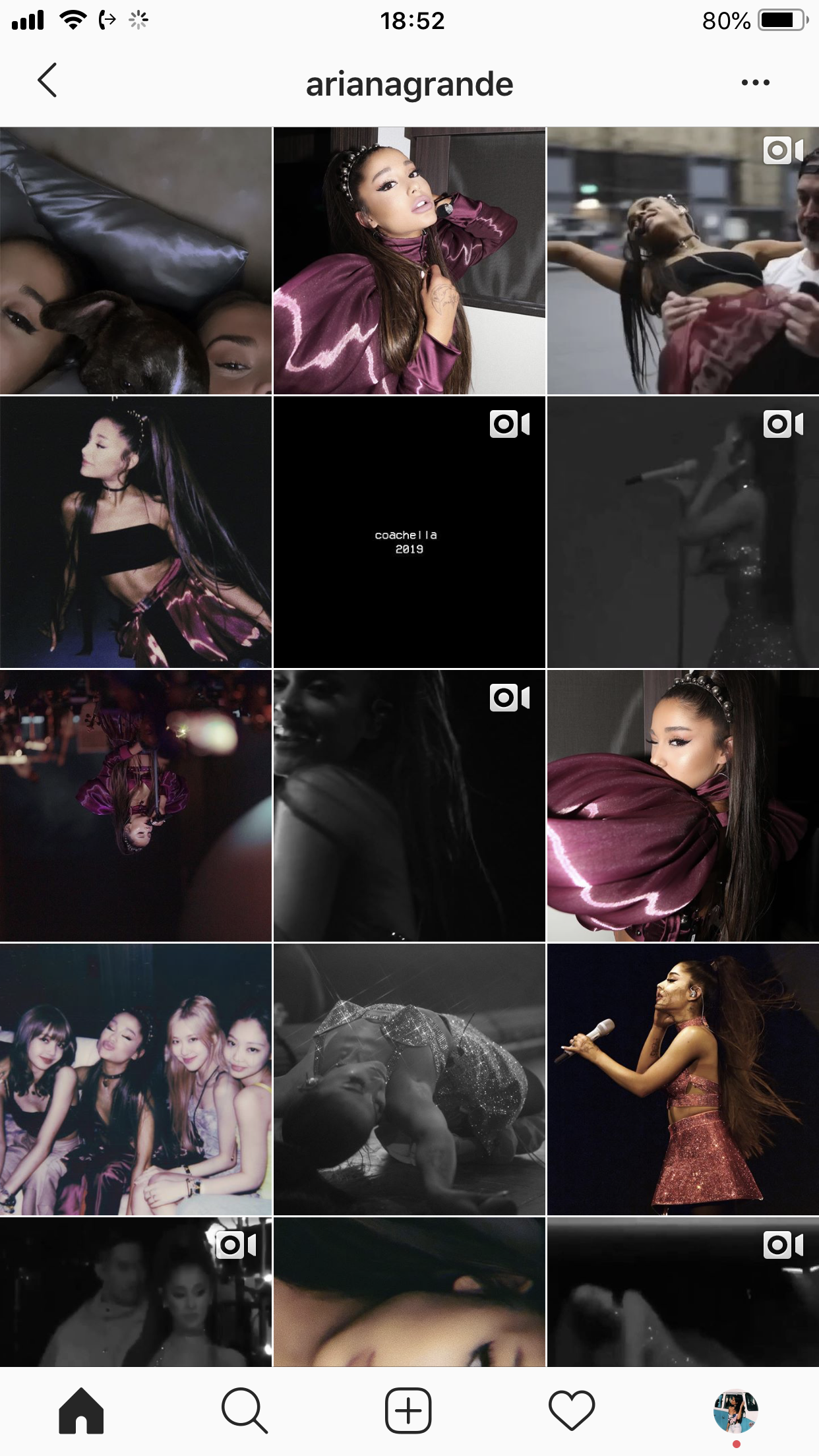
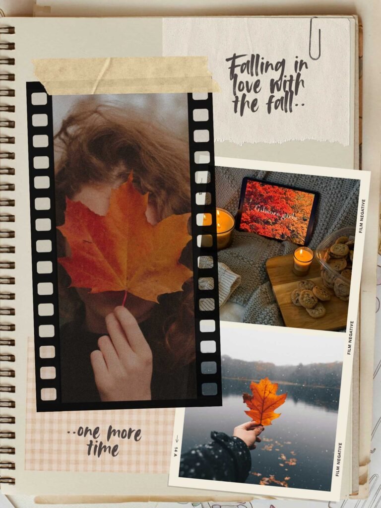
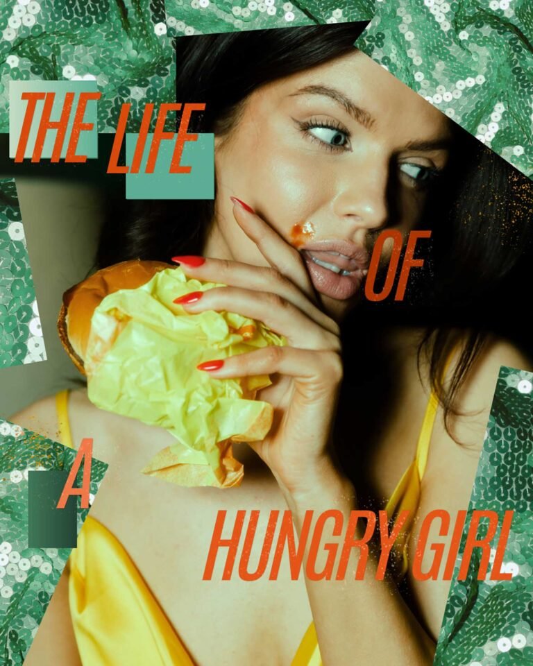
Another aspect that can determine the weight of a photo, and helps define an appropriate and harmonious disposition of elements are the colors. Especially in case you want to punctuate specific hues. Examples:
See what I mean? 🔆💖
Now, it takes trying, testing, playing with the options and possibilities and, with time, you’ll become an expert! ☺
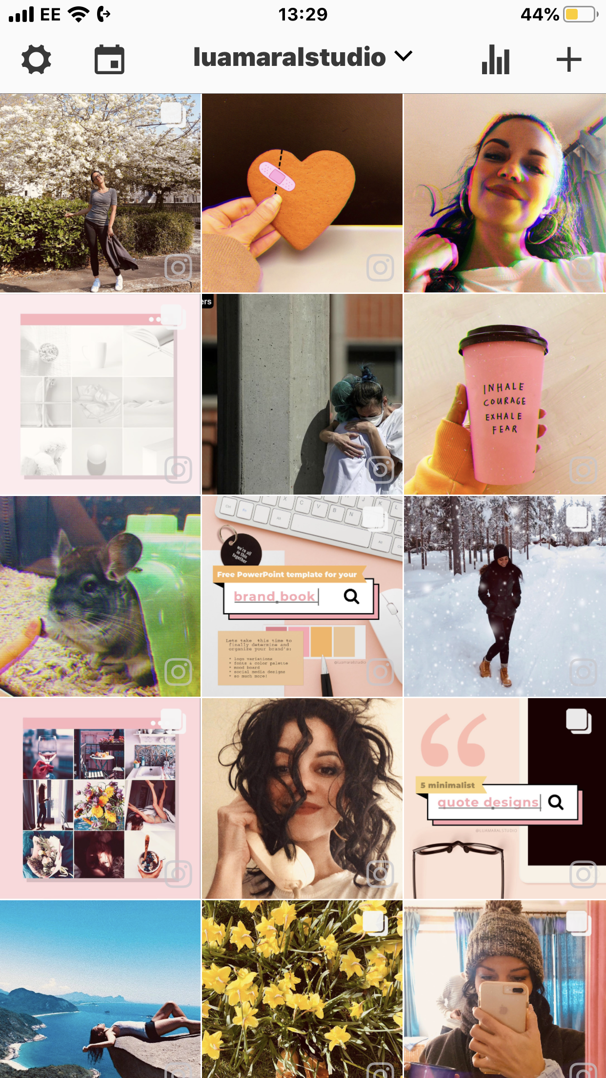
Oh, and back to our feed development, I reorganized the disposition of our photos in a prettier way:

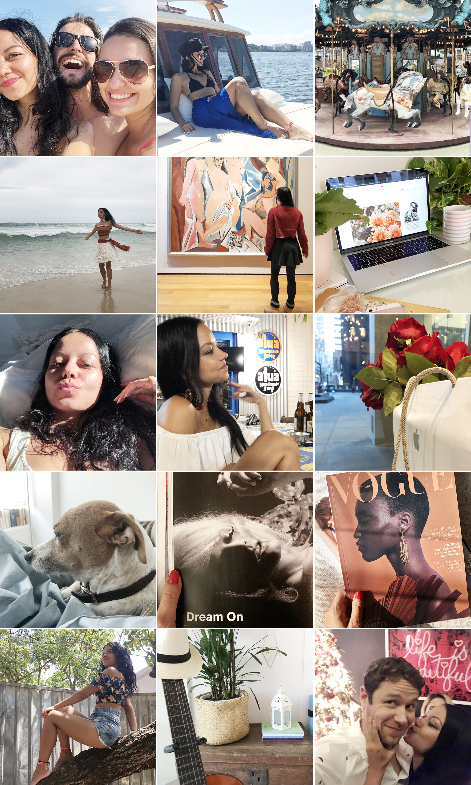
Random disposition 
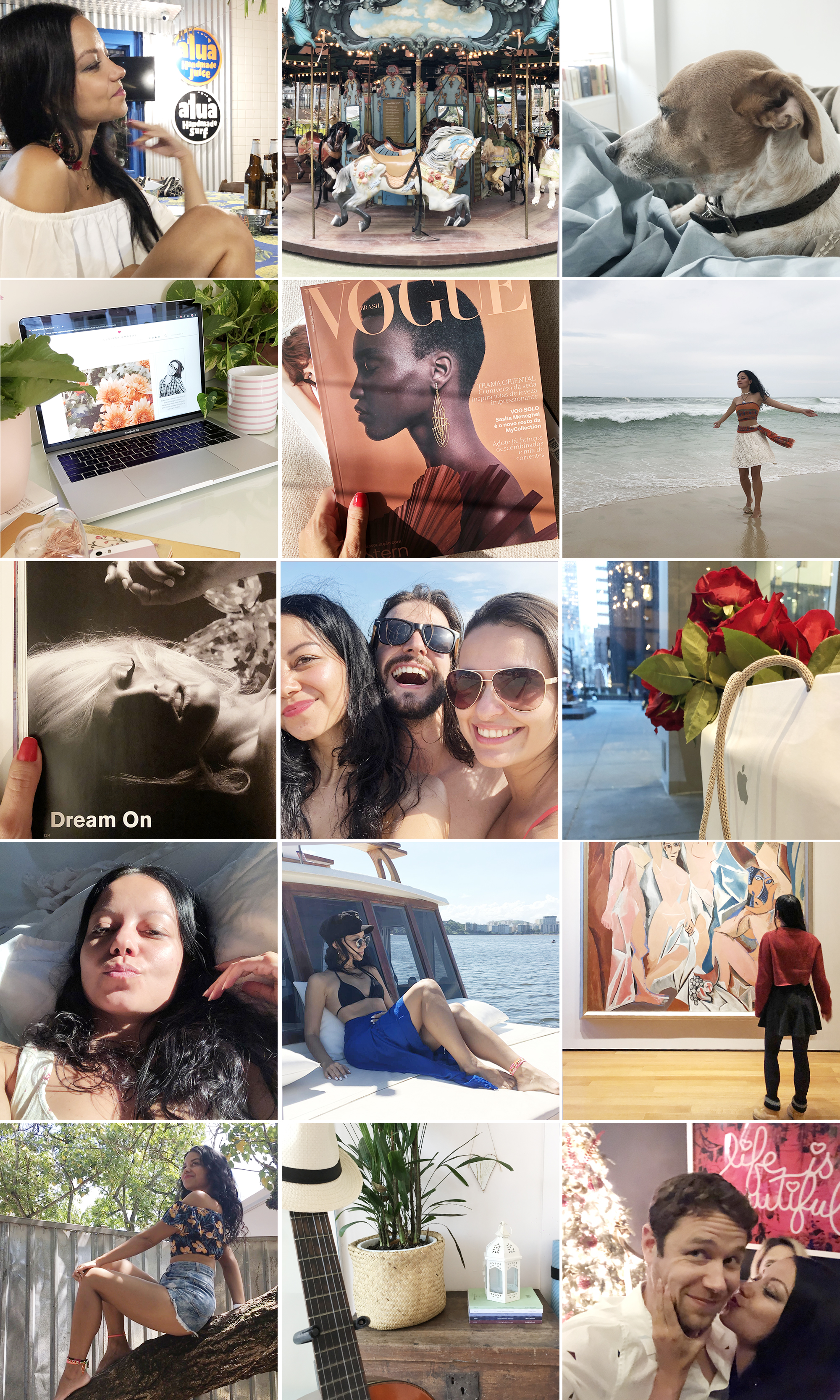
Improved disposition
Tomorrow (hopefully) I’ll publish the forth post of the special. And it’s the one you’re probably waiting for… FILTERS! 👩🏽🎨✨🤩🤩🤩
Update: Check out the other posts of the series below:
1. Brighness
2. Alignment
4. Filters
5. Uniqueness
Beijos,
Lu

Discover more from The Aesthetic Shop
Subscribe to get the latest posts sent to your email.
