And here we finally are, chicas. We’ve reached the last post of our Instagram feed special! 🦄💜
We’ve been through the importance of brightness, alignment, disposition, filters and now we’ll talk about uniqueness.That finishing touch that will make your feed authentic, special and different from everyone else’s 💖💫🤩
Of course, this step is optional. You can organize your feed just by adjusting the photos well and applying your unique filter on all images. But by adding an extra touch of design, you’ll be really upping your insta feed game. This is the time to put that cherry on the top!
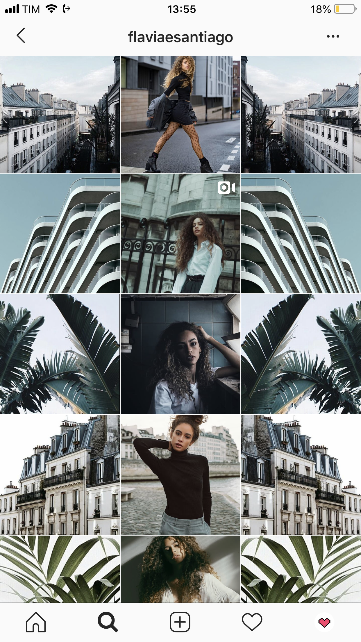

When I wrote the third post in the series, I thought I’d mention some ways of distributing your posts in your feed. But I chose to focus that post on the visually harmonic disposition, and on this one, to talk about the more creative side.
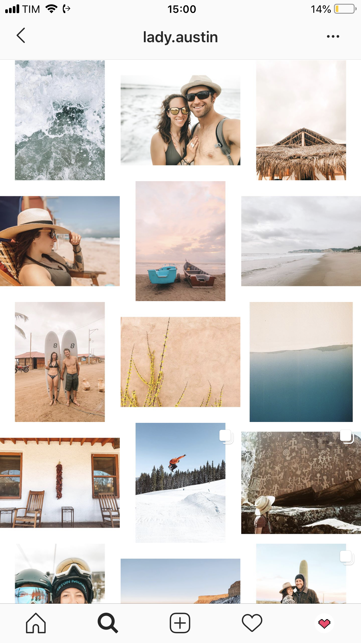
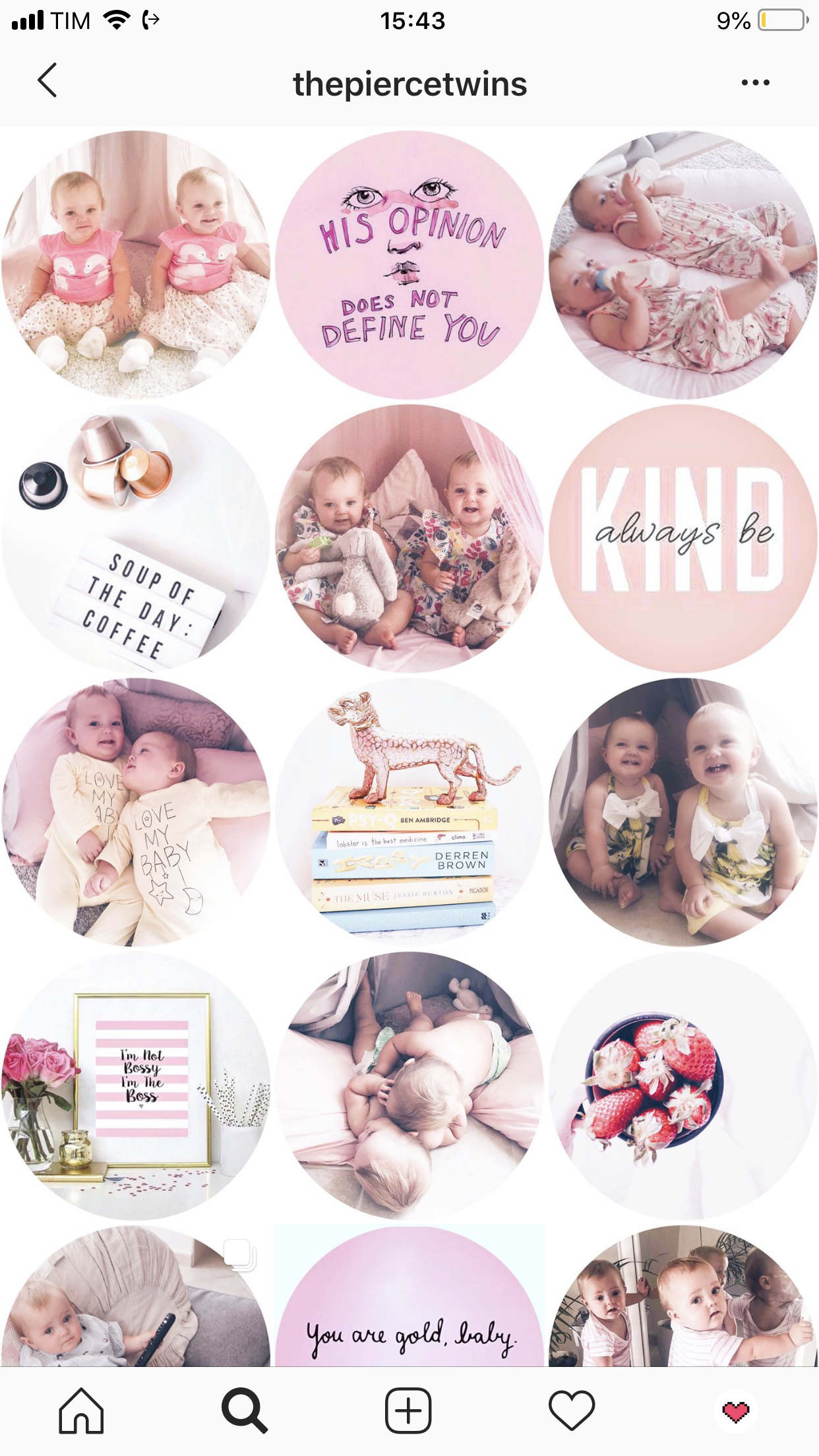
There are many ways to increase your feed’s style with something special. A common one is to use quotes, illustrations or generic images beyond your own photos, but following your style and color palette. In addition to giving that striking personality touch that punctuates the feed and helps connect the whole grid aesthetically, with these posts you can show who you are, what you think, what you like…
In the two examples below, I did just that:
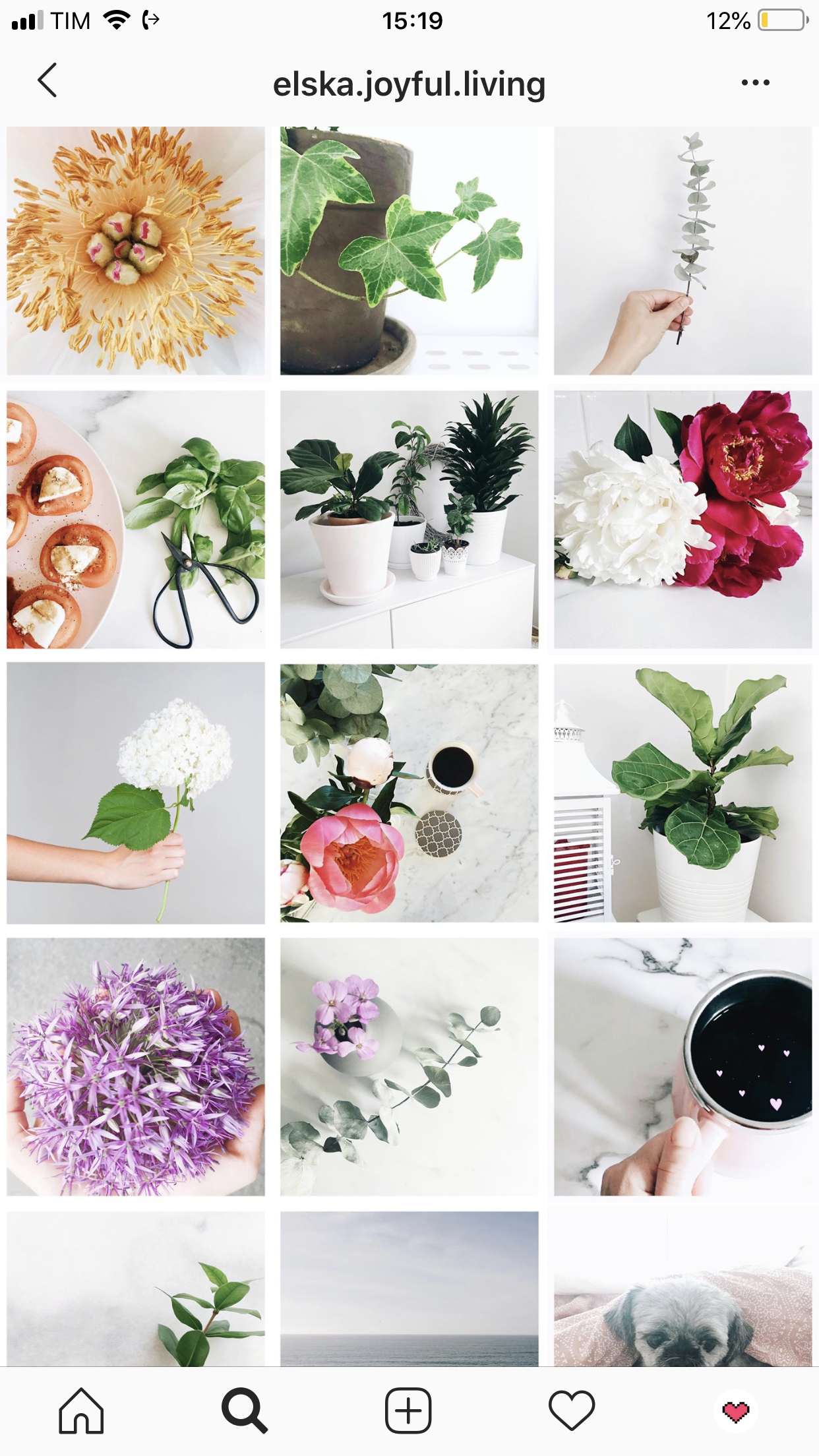
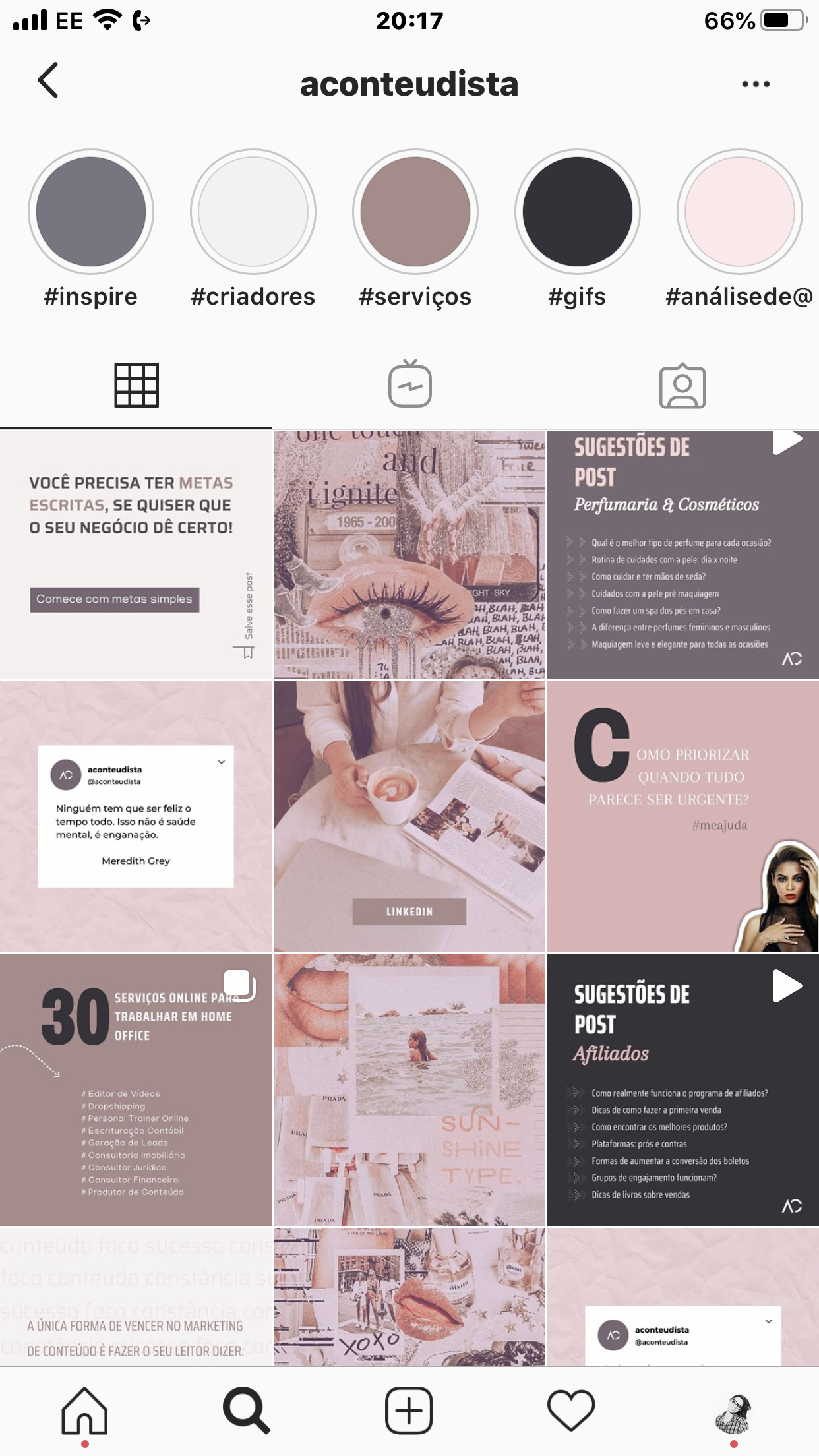
On these examples below, however, the uniqueness is in the posts themselves. The one on the left has very thin borders every other post. I looove it! And the one on the right is all about the polaroids 😊😊
You can use Photoshop, Canva, PicsArt, Meitu and many other apps to do edits like that on your pics 💕
Another way to stand out and differentiate your feed from others is the super popular the puzzle feed. I’ve posted about it here, but I’d definitely check this post out too, before deciding to go down that road haha!
Is it cool to use borders on the posts?
I get asked that a lot too. For my personal taste, I like borders (or frames) only when they follow a pattern. For example, using the frame in ALL of the posts, or every other post, always with the same width.
Random borders give me a feeling of disorder and I don’t feel like looking and exploring each image separately when that happens. Also, always using borders and following a pattern like that takes work and requires a commitment to the style. We talked about that at length on post number 4 of this series. You might come across a perfect photo that that you’re dying to post, but the border thing just doesn’t go with it. So you chose not to use the border and the whole feed is compromised haha.. Think about that before you start any patterns 😉
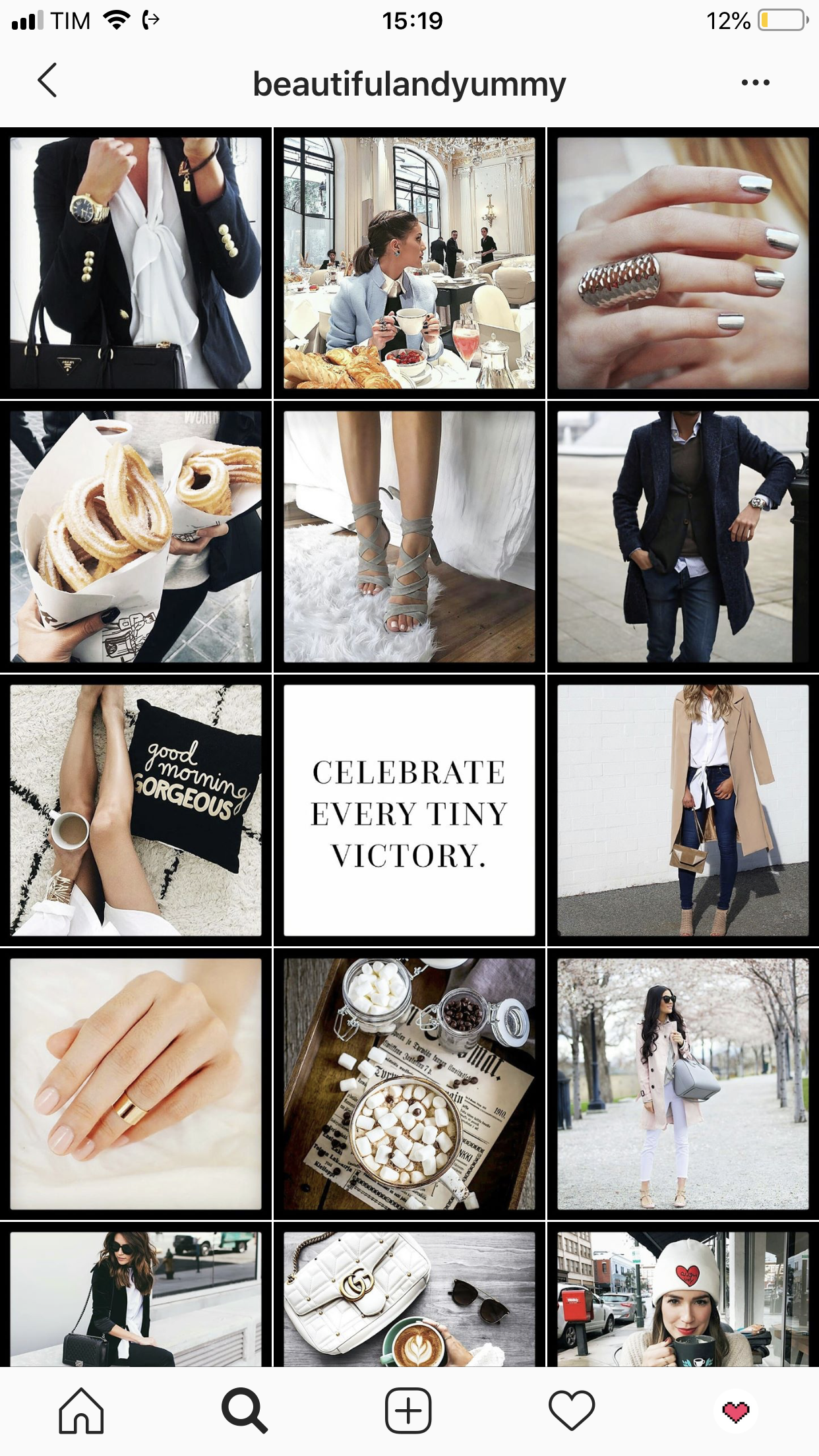
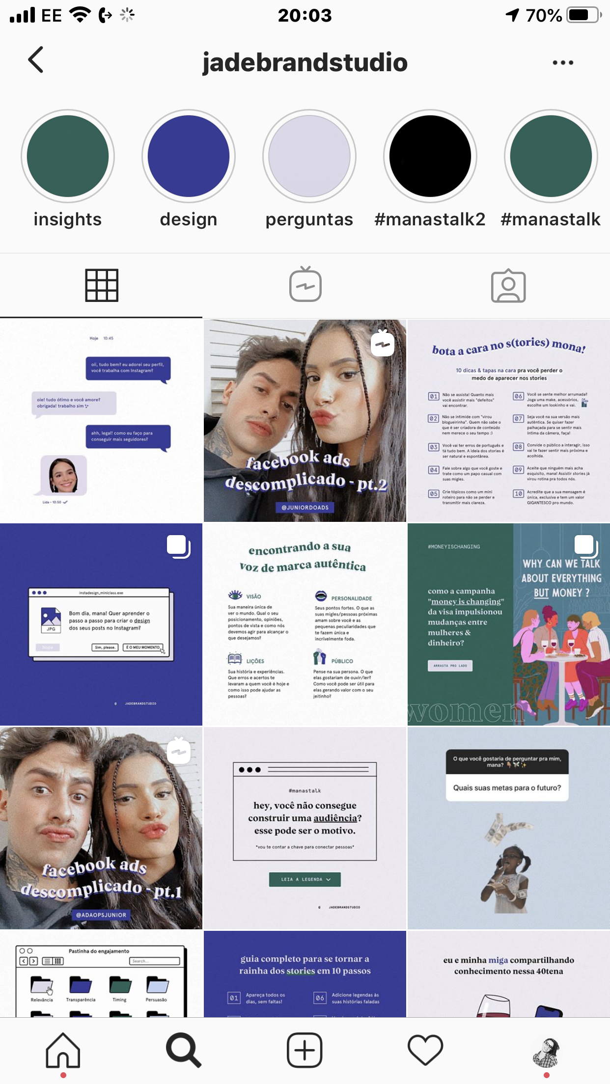
Here’s a few examples of borders being used in a way that I 🥰🥰🥰🥰:
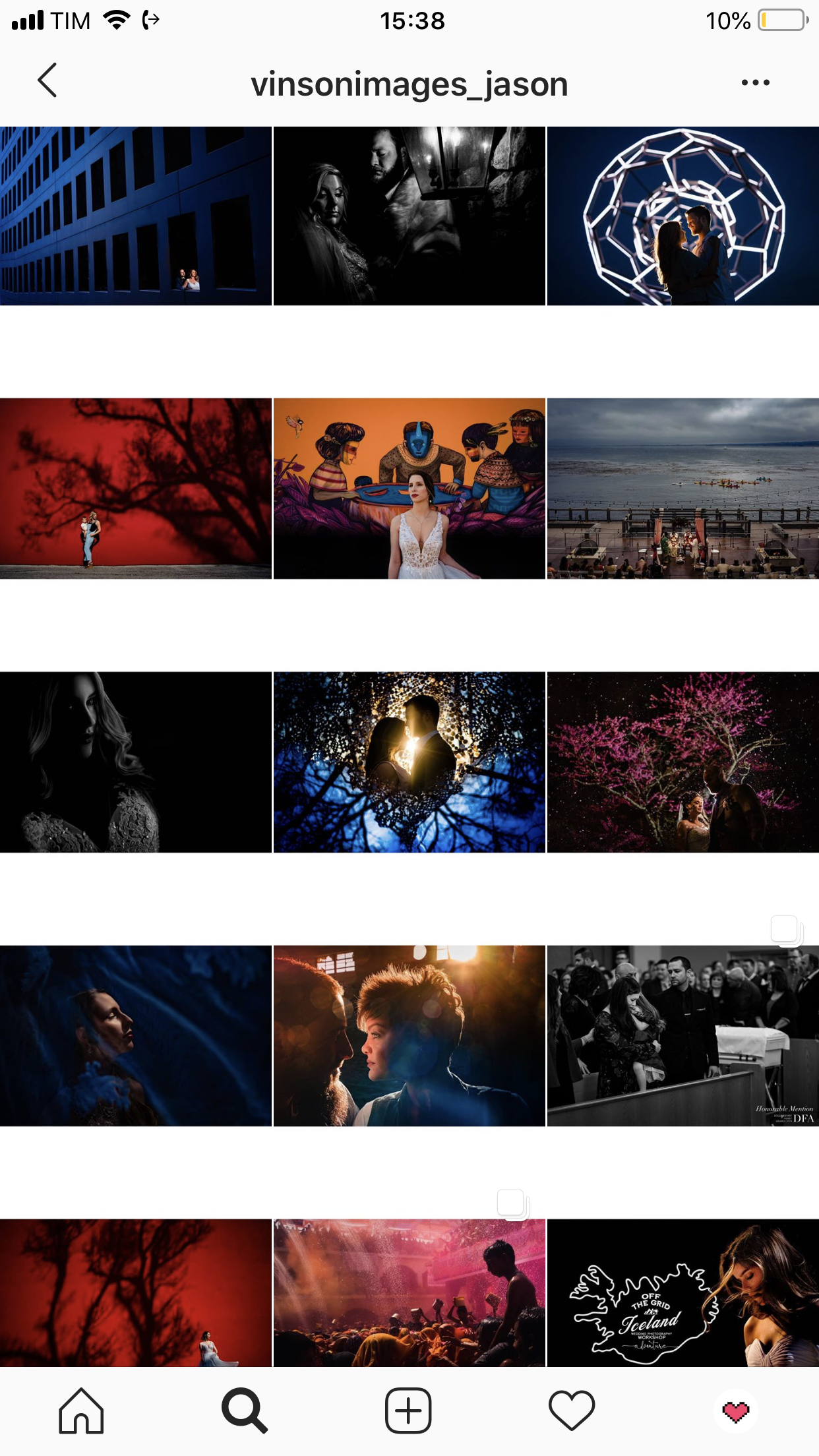
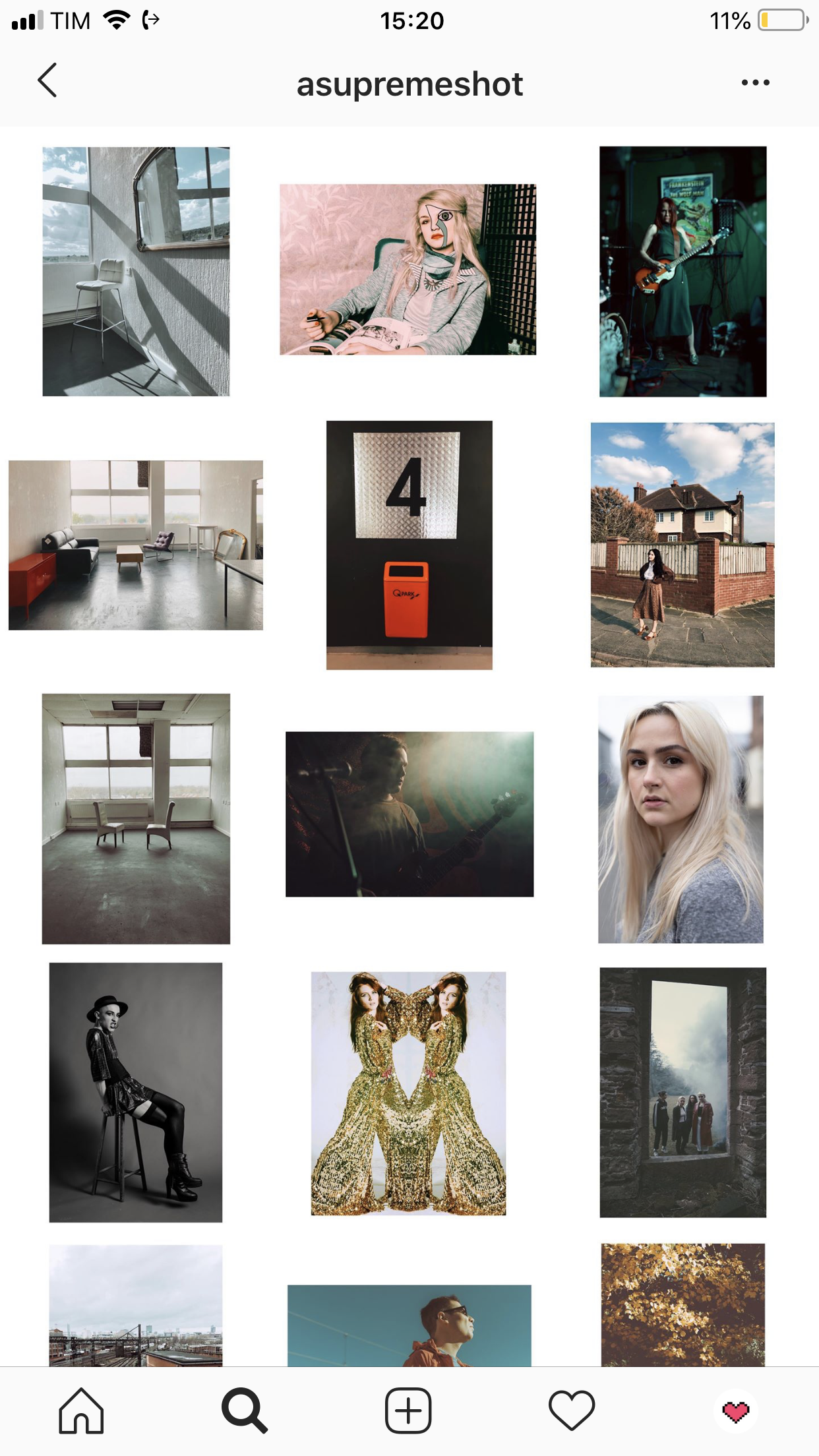
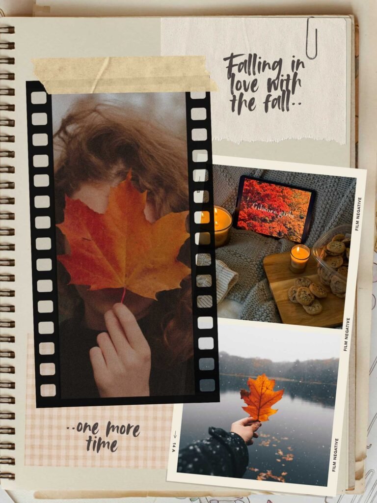
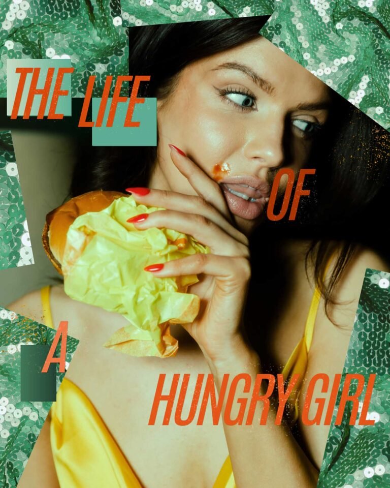
Whatever your choice for the uniqueness touch is, if the goal is a whole, integrated feed like we’ve been talking about in the special, it has to match your photos nicely. Quotes, designs, collages, everything has to communicate with the same language. So even if the content of one post is completely different from the next one, you need to find elements that connect them visually. On the examples below you’ll see what I mean:
And now, time to finalize our feed!
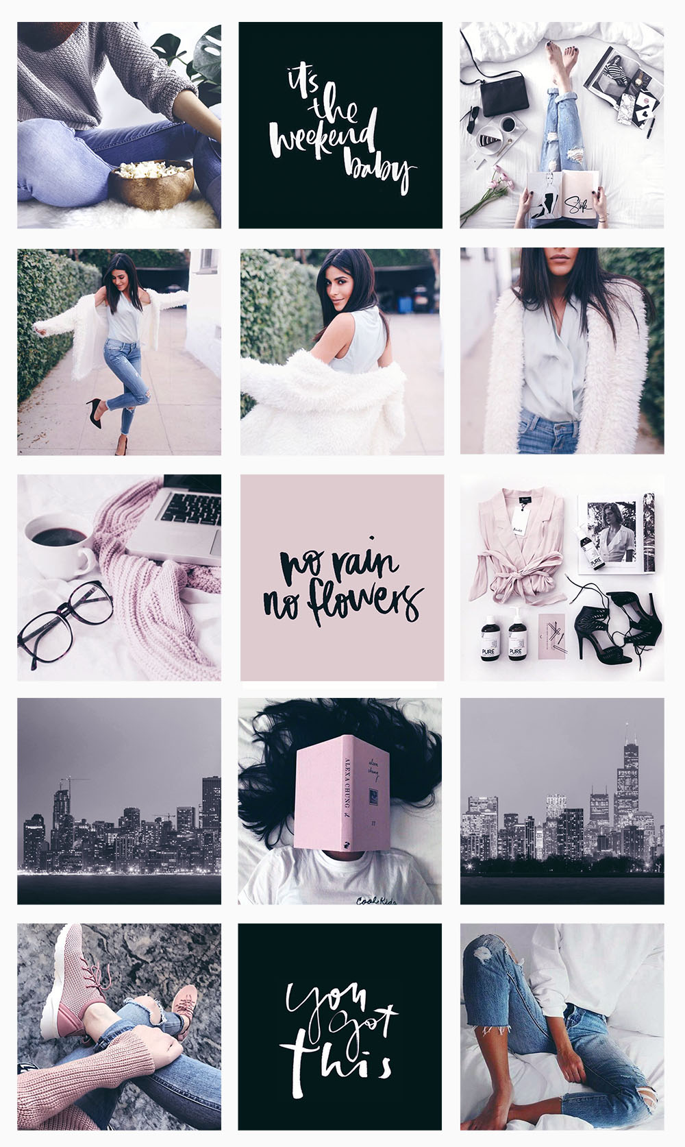
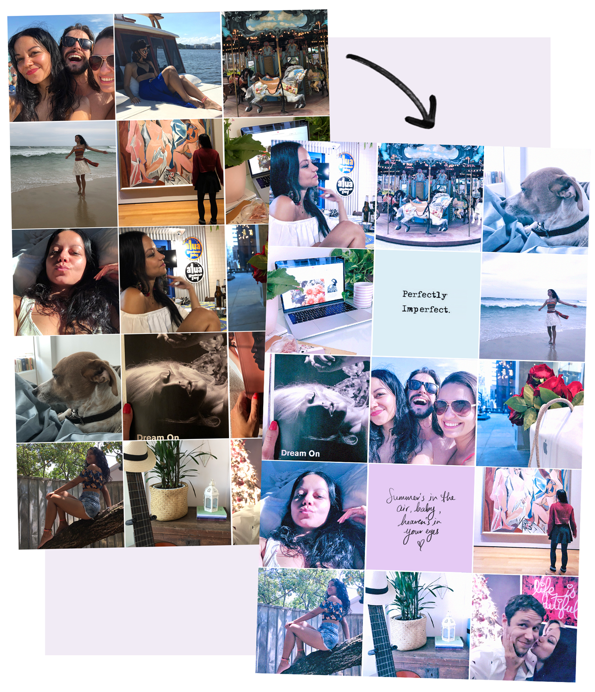
After completing the 5 steps introduced in this special, here’s the result. I’ve placed two cute quotes I found on Pinterest, changed the colors to shades that match my theme, and that’s it! ✨✨
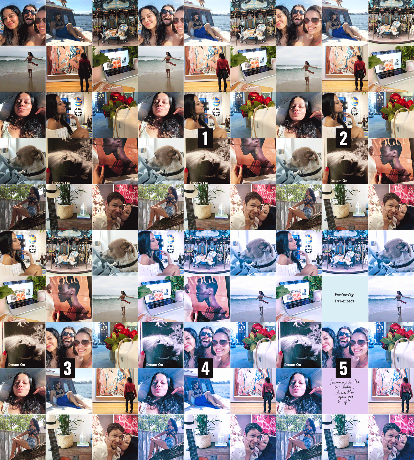

Thank you for sticking with me till the end, chicas. See you on the next post? ☺💗
Update: Check out the other posts of the series below:
1. Brighness
2. Alignment
3. Disposition
4. Filters
Lu

Discover more from The Aesthetic Shop
Subscribe to get the latest posts sent to your email.

