Hey guys!
Continuing our special in 5 steps of how to have an Instagram feed that is neat, beautiful and authentic (I keep changing these three words to keep you interested haha), today we’ll focus on the ALIGNMENT. Yesterday I wrote a lot about the importance of brightening the photos well, so if you haven’t read the first post, just click here 💖✨
First of all, promise me you will not be intimidated by this step! It’s so very important to work on if you want to achieve that super cute feed you dream of, and I swear it’s so easy to do.
The great thing is, this step is kind of a little secret, because I don’t really see a lot of people using it in their favor. And it makes a huge difference. Once you start paying attention to it, it becomes an OBSESSION! hahahahaha (or is it just me tho 🤨😂😂)
The Importance of Aligning Photos in your Feed
The fact is, humans react well to super organized, harmonic, well-distributed objects. It makes us feel comfortable knowing there’s a pattern and a logical order to the elements, and that makes the scene pleasurable to look at. And although there’s no need for you to have total control over the alignment of every little detail in the photo, trying to find a balance in that sense greatly favors the image.
But how to do it? 🤔
Tip: Look for the baseline of the photo. Usually it’s the ground, the horizon, or vertically it could be walls, buildings…. In most of the photos we take, they are bent to one side or another, or up or down. So a good starting point is to try to make those lines straight.
Check out how I fixed the images on our feed down below:


How to straighten photos on my phone?
Easy! Most photo edit apps like VSCO have the alignment tool that allows you to do this. The iPhone built in image editor has it as well:
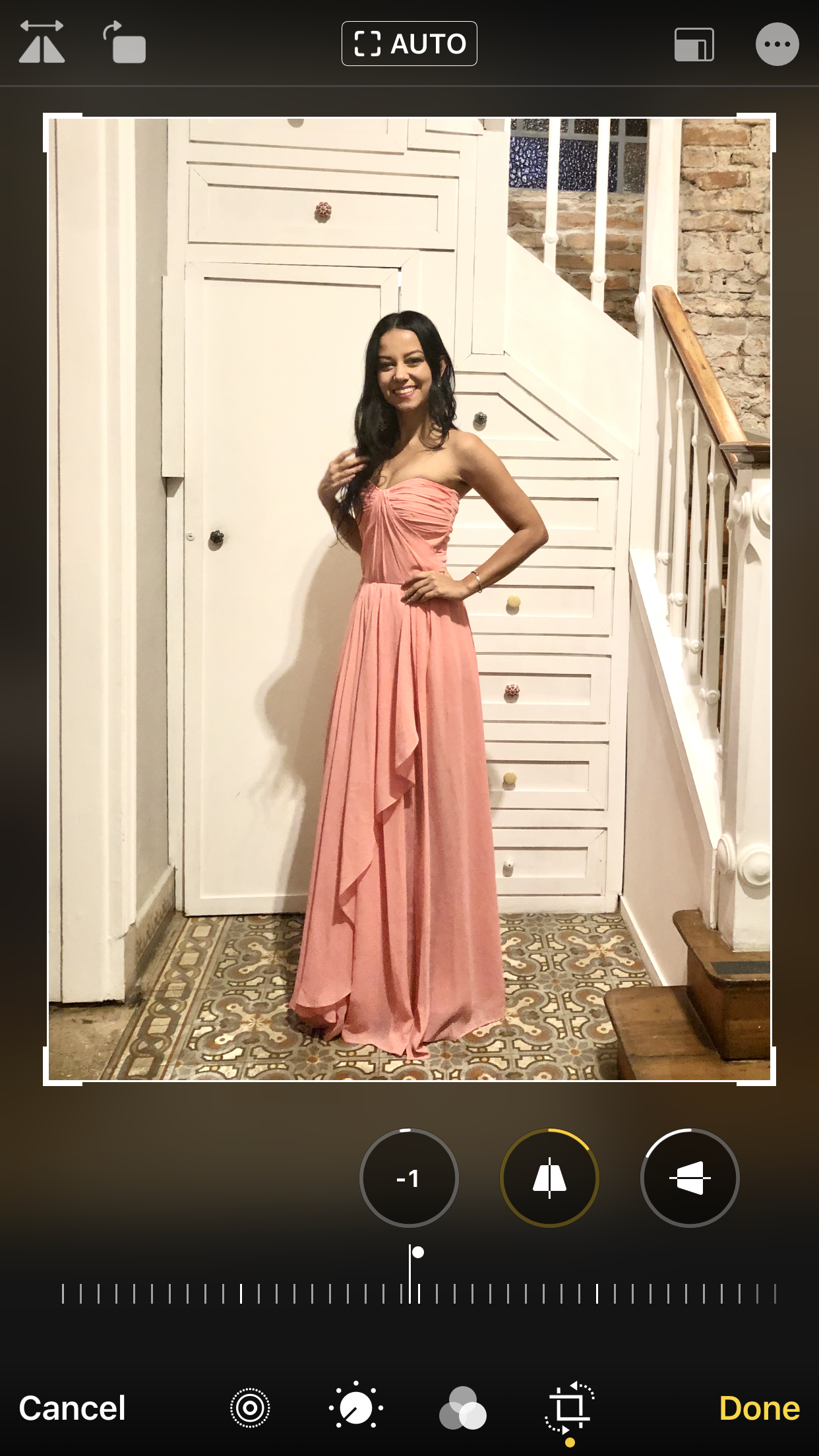

I think the first question popping up in your heads when I say this is: do all images always have to be perfectly aligned then? And the answer is: not all of them.
But I suggest that you always take a careful look at your pics to see if the lines are straight, if the main object is well positioned and if it needs better cropping. It might seem like a silly detail, even irrelevant on one photo, but in the whole feed it gives lots of harmony and makes the design more beautiful 🌷


To center or not to center?
Regarding the position of the main object of the photo, I know it’s difficult to have every single element perfectly centered on every single post. And it might not even work for some accounts, because it looks a bit monotonous, although it is definitely a good option in many cases as well. So if you want balance, my suggestion is to interleave well centered photos, with others where the main object is more to the left, then to the right, and so it goes. And that goes for selfies, group photos, nature photos, objects, pets, food, sunsets…
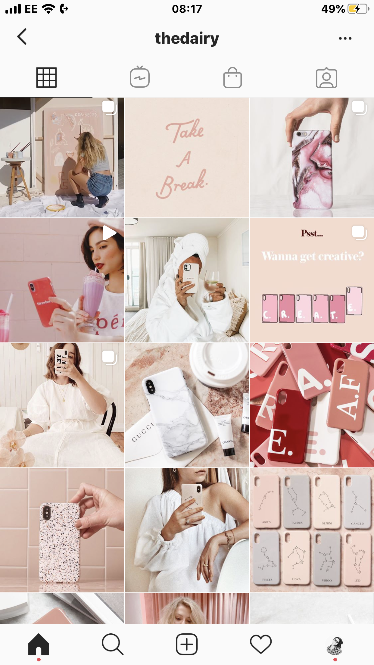

But Lu, some photos look much cooler when they are not aligned straight! – I agree! Tbh very recently I twisted a photo in a way that it looked more crooked and natural. So I get what you mean! Over time we learn how to tell when I pic has potential to look better centered/straight or not, and how to use them on our feed 🤓💕
I took these 4 feed examples below, with well aligned photos, to illustrate this point. Look how it works both for the more minimalist style and also for the “busy” style. For images with people, objects, spaces…


So that’s it! This is the second step to reach our #feedgoals and there’s a lot more cool stuff coming soon 🦋
I hope you are enjoying this special. I would loooove it if you can leave a comment by saying what you thought!
Update: Check out the other posts of the series below:
1. Brighness
2. Alignment
3. Distribution
4. Filters
5. Uniqueness
Beijo!
Lu

Discover more from The Aesthetic Shop
Subscribe to get the latest posts sent to your email.
